Making a Choropleth Map
A choropleth map is a map that colors different areas of the map based on some data. The Human Migration - 2010 - 2015 dataset is one example of a choropleth map in the Science On a Sphere® catalog.
Shapefiles
Permalink to ShapefilesSo far, this tutorial has only dealt with one type of data: a spreadsheet, which we use in .csv (comma separated variable) file format. This format is suitable for plotting data in the form of points or locations, but if you want to show data on a per-region basis (such as life expectancy per country), the easiest way to do so is to use an ESRI shapefile.
A shapefile is actually a group of several files that must be kept in the same folder to work. There are a few ways to get them. The first is to simply download a shapefile from one of any number of websites (a list of suggestions is provided below). The second is to create a new shapefile from a spreadsheet or .csv data, which is primarily useful if you can’t find a pre-existing shapefile with the right elements. The easiest way to create your own shapefile is to use CartoDB.com, a mapmaking website. And finally, you can add new data to a pre-existing shapefile by adding columns in the layer’s attribute table.
Getting a Shapefile from the Web
Permalink to Getting a Shapefile from the WebStart by searching for whatever dataset you like as an ESRI shapefile. Some good places to start looking are:
- Natural Earth Data. These datasets are good as base maps, but probably won’t contain data that can be used to color-code regions — these maps are usually just borders. However, if you want a base map composed of vector data, this is a good place to start
- Geocommons. User-submitted maps containing all sorts of data. Search for any kind of map, then click on the “shapefile” button to the right of the map (if available) to download the shapefiles
- MapCruzin. A luck-of-the-draw eclectic collection of maps and shapefiles. Some shapefiles contain data that can color-code countries, such as historical earthquake occurrences per country
For the purposes of this example, I’m going to use the Life Expectancy shapefile from Atlas of the Biosphere. Although this dataset is labeled “Life Expectancy,” it actually has numerous other statistics included in it, such as infant mortality rates, access to safe water per country, etc. You can click on the link that says “Download a GIS grid of this data (ESRI ArcGIS format). This will open up a new page, with a button that says “Download Now.” Click on it.
It will download a zipped file. At the bottom of your screen, a Downloads bar should 21appear with an icon that says “lifeexpectancy.zip.” We need to unzip it, so double click the icon to open the zipped folder. Once the folder opens, you should see all the files inside it. Go up a folder in your file tree so you can see the folder the files are stored in, lifeexpectancy.zip. Right-click it and select “Extract all.” Make sure you extract the files into a location where you’ll be able to find them again.
Loading the Shapefile
Permalink to Loading the ShapefileNow, go into QGIS and start a new project by going to ProjectNew. Click the Add vector layer button. You can also click on the Layers menu at the top of the page and select Add Vector Layer.
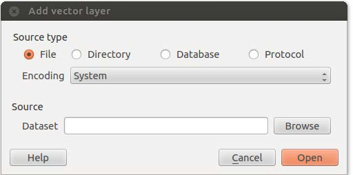
The Add vector layer dialog allows you to choose a shapefile for your Dataset and import it into QGIS.
Click the Browse button next to the Dataset field and navigate to your extracted files. You want to upload the one that has the .shp extension — that’s the actual shapefile. Click Open.
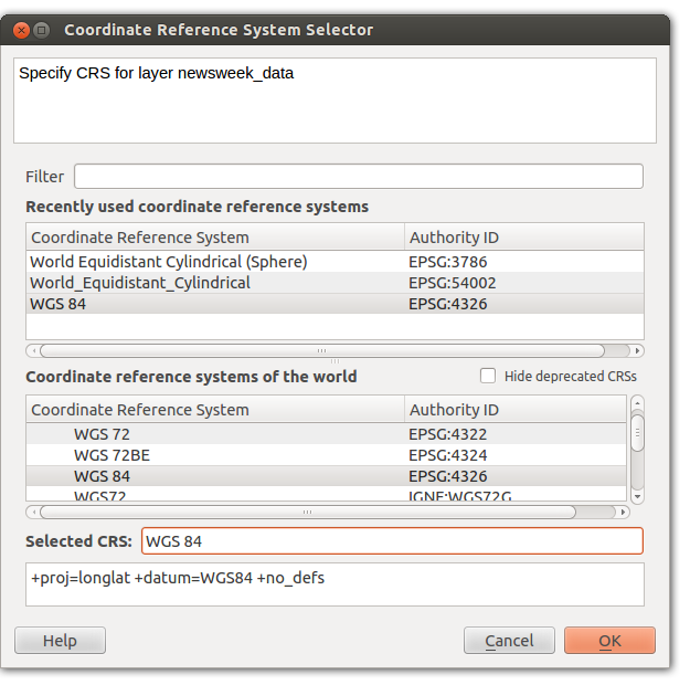
Use the Coordinate Reference System Selector to set your coordinate system to WGS 84.
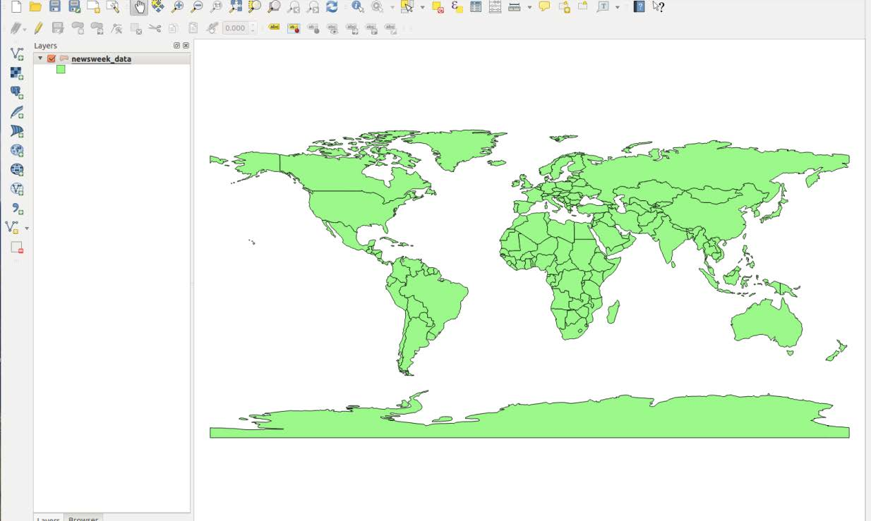
Your map should look like this after loading the Life Expectancy shapefile as a vector layer.
A window will appear asking you to specify the CRS — that’s the Coordinate Reference System. SOS uses WGS 84, also known as EPSG:4326. Select this if it isn’t already selected and click OK.
Styling the Shapefile
Permalink to Styling the ShapefileTo style this shapefile, you’ll want to choose a column of data such as Life Expectancy and tell QGIS to color countries based on the values in that column. In the interest of not reinventing the wheel, please see Ujaval Gandhi’s tutorial on the basic vector styling.
Some points to be aware of:
- Assuming you’ve followed the steps above, you can skip to step 4 of Ujaval’s tutorial. Steps 1–3 are instructions on how to get the data into QGIS
- When you color countries according to values in a column, countries with no values in that column will get grouped with the countries that have the smallest values. QGIS assigns those countries the value “-99” for some reason
- If you only get two colors in your map after assigning it a color scheme, try changing the mode or adding more classes
Once you have styled your map to your satisfaction, please skip to the Exporting Maps as Images section of this tutorial. You’ll also add legends, colorbars, and other map features in that step.
Example of a styled map: access to contraception per country. I used the graduated symbols option with seven equal-interval classes and the “Blues” color ramp to make this map.
Creating a Shapefile Using CartoDB
Permalink to Creating a Shapefile Using CartoDBCartoDB is a website that allows users to upload spreadsheets of geographic information and plot them on a map of the world. Unfortunately, the map CartoDB uses is in the wrong projection to work with SOS (see the write-up on CartoDB for more information), but it’s still a useful tool for converting CSV files to shapefiles. The process of converting text or image information to information that is associated with location coordinates is called georeferencing. CartoDB can do that for us.
Getting CartoDB
Permalink to Getting CartoDBIn this case, getting the mapmaking software is very simple: go to www.cartodb.com and create an account. CartoDB designs plans based on storage space. If you’re importing a lot of data for individual maps, or creating a lot of maps, you’ll need to get one of the paid versions. If not, scroll down past the descriptions of the paid versions and click on “free version.”
For this tutorial I will be using the International Telecommunications Union’s database of landlines and mobile phones registered throughout the world. These files weren’t quite in the format CartoDB can use, so I had to mess with them in Excel first. This is frequently the case with databases on the web, and since this particular spreadsheet’s issues were very specific, I won’t go into how I solved them. If you would like to recreate this dataset, please see the collection of datasets provided along with this tutorial. The file is called Fixed_tel_2000-2012.csv.
To start, go to the green Dashboard button in the top-right corner of the page. This will get you to your dashboard page, where your datasets are stored in table format. Click on the large + button labeled New Table.
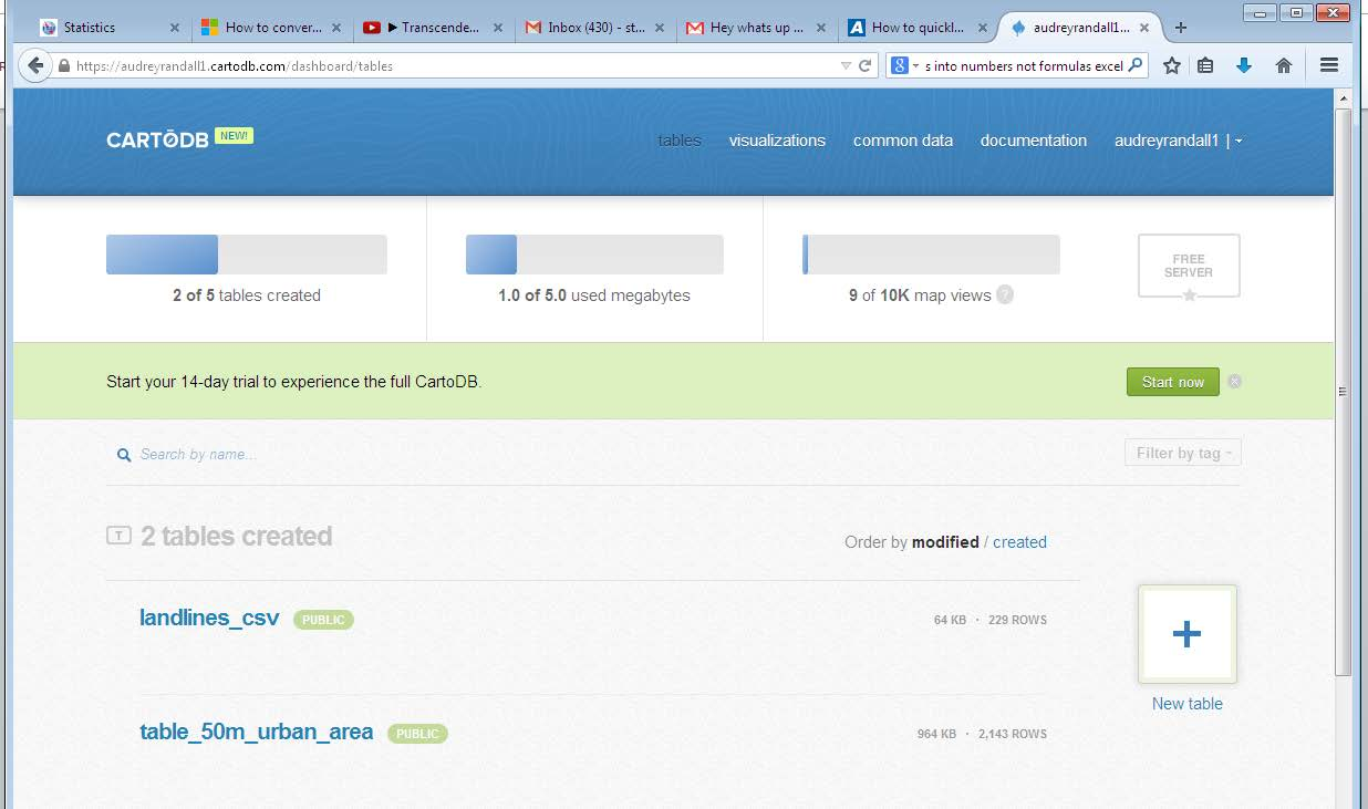
Use the New Table button on the CartoDB dashboard page to upload data files to CartoDB.
Select Select a file, and find the spreadsheet you need. CartoDB can take Excel, CSV, TSV, ESRI Shapefiles, KMLs and KMZs, GeoJSON, GPS eXchange (GPX), OSM and BZ2, OpenDocument Spreadsheets (ODS), and SQL. See the CartoDB documentation for more information. Click Open. Your table will appear.
At the top of the screen, just above your table in the left hand corner, will be the words Table view and Map view. Click on Map view. This window will appear. If it does not, click on the Options button in the top right corner of the screen and select the Georeference option.
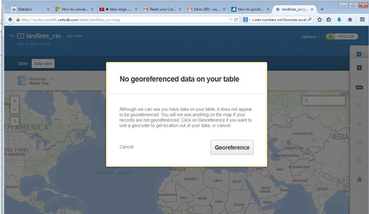
CartoDB will prompt you to georeference the data after you upload it so that it can display the data on a map. Click the Georeference to configure your table.
On the next window that appears, you’ll want to click You have a column identifying administrative regions since our data is referenced by country, not latitude and longitude coordinates. In the In your table the polygons are identified by… field, select field_1. This means that the countries are listed in the field_1 column in your dataset. If you look at the column heading in CartoDB’s Table View over the column with country names, you’ll see that CartoDB has labeled it field_1. You want your data in the World by Countries just like the default settings say, so click Georeference.
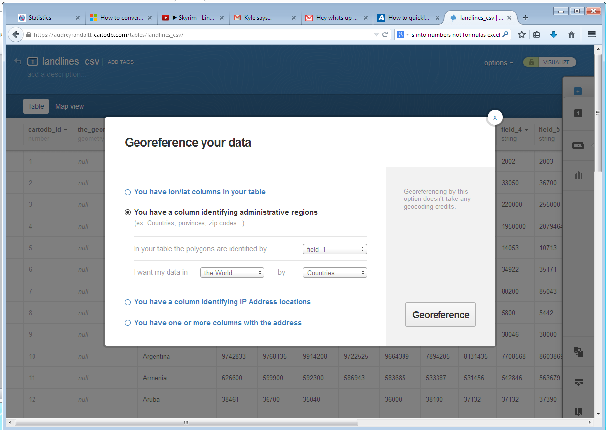
Use the Georeference your data dialog to tell CartoDB which column in your data contains the country names.
A screen will come up with two boxes; one will be greyed out and say No point data available for your selection and the other will say Georeference your data with administrative regions. It should be highlighted. Click Continue. The data will take a minute to render.
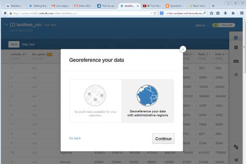
CartoDB has two modes for interpreting geographic data: as points or as administrative regions. In this example, only the administrative regions is relevant.
CartoDB will then give you a message “X out of Y rows were successfully turned into polygons!” If the number of rows turned into polygons was lower than you expected, go through your data in Table view to make sure country names are spelled correctly. If you have rows with no value in field_1 (that’s the column with the country names), CartoDB thinks it’s misreading the rows and will count them along with the rows it couldn’t transform, so check to see if that’s the cause of the discrepancy. If it isn’t, go into Map view and find the countries that aren’t overlaid with a color— these are the ones CartoDB couldn’t parse. For example, Iran in this dataset was labeled as “Iran (I.R.).” CartoDB couldn’t recognize that so I changed it to “Iran” by double-clicking the name to edit the text.
You may have to delete and re-upload your table to make the changes take effect, in which case you should make your changes in the original spreadsheet, save that spreadsheet as a .csv file (or whatever format was originally used), and upload it just as you did before.
Now click on the Options button in the top-right corner and select Export.
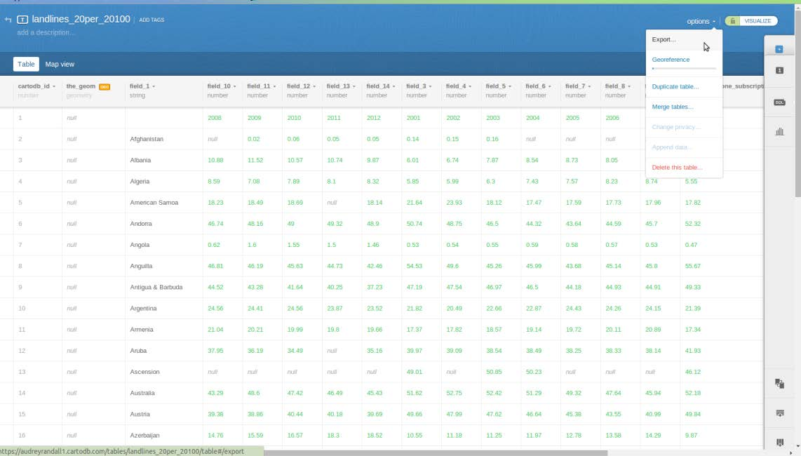
You can find the Export option in Options
Select shp as your file type and save your file in a place you can remember it.
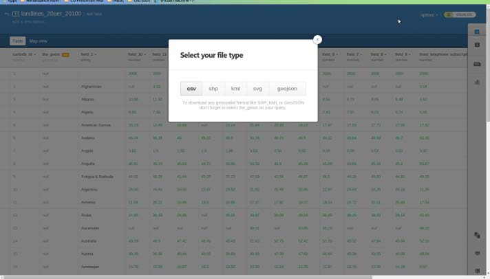
CartoDB offers several different export options. You want shp.
The shapefile will be downloaded onto your computer as a zipped file. Unzip it by right-clicking the file and selecting Extract all. Extract the files into a place where you’ll be able to find them again.
Now that you have a shapefile, you can follow the instructions for the previous section, Getting a Shapefile from the Web, beginning with Loading the Shapefile.
Joining a File to an Existing Shapefile
Permalink to Joining a File to an Existing ShapefileTo “join” a shapefile and a spreadsheet means to add the data in the spreadsheet to the data in the shapefile. For example, if you have a shapefile of countries and a spreadsheet of population data for the same countries, to join the file, you would tell QGIS that the two columns with country names in them should be matched. Then, in addition to the shapefile’s original data for each country, the shapefile will contain the population data as well.
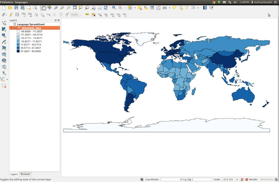
For this example, I will be using the Life Expectancy shapefile from Atlas of the Biosphere. This is the same dataset used in the Getting a Shapefile from the Web section of this tutorial. For the spreadsheet, I will be using the Language Spreadsheet provided by Brown University. It describes the most prevalent language of countries in the 1500s.
To use it as described in this tutorial, simply save it on your computer, then open it. Go to FileSave as. Save the spreadsheet as a .csv file by changing the file extension from .xls to .csv.
First, you need to open the spreadsheet in QGIS. To do so, go to LayerAdd Vector Layer and select the CSV file you just created. Note that you’re not adding it as a delimited text file, which is what we have done in the past. Click Open. It will appear in your Layers bar on the left side of your screen, but no data will appear on your map, since QGIS doesn’t know how to interpret it yet. Please follow the steps in Loading the Shapefile for importing a shapefile to import the Atlas of the Biosphere shapefile. Once you have your shapefile, right-click on it in the Layers panel on the left side of the screen and select Open attribute table.
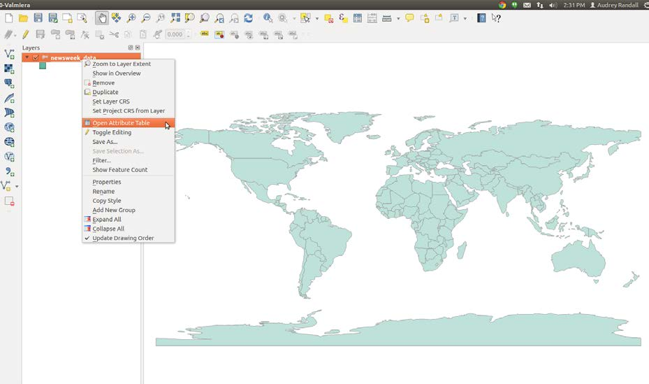
Use the context menu on your layer to open the spreadsheet you’d like to join to your shapefile.
You need to find an identifying column of shapefile data that will match up with a column on your spreadsheet — in our case, we’re looking for the country codes. We’re using those instead of names because QGIS has to see exactly the same word in the spreadsheet as it sees in the shapefile’s data, or it won’t be able to match the two. Differences in abbreviation or spelling errors are easier to avoid if you’re using three letter codes instead of names, since the codes are standardized.
Look through the attribute tables of your shapefile and your speadsheet to find the name of the column that contains the country codes. As it turns out, those are under the column labeled “Code” on the spreadsheet and the column labeled “WB_CNTRY” in the shapefile’s attribute table. Once you’ve found both, close both attribute tables.
Now open the shapefile’s properties window. You can do this by right-clicking the name of the layer in the layer bar to the left and selecting Properties or by simply double clicking the layer name.
Go to the Joins tab and click on the “Add” button.
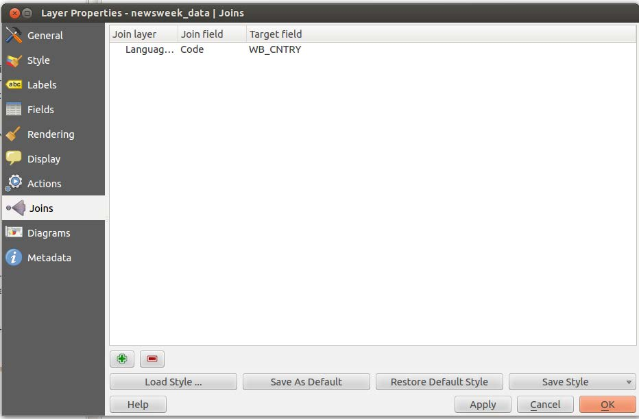
The “Add” button in the Layer Properties dialog is represented by a green plus (+) icon.
A window labeled Add vector join will appear. Select the layer you want to join to the shapefile (our Language Spreadsheet layer), the join field (that’s the column of the spreadsheet, “Code”) and the target field (that’s the column of the shapefile’s attribute table, “WB_CNTRY”). Make sure that Cache join layer in virtual memory is checked. Click OK on the Add vector join window and the Properties window.
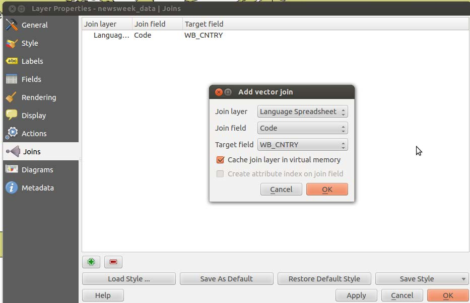
The Add vector join dialog allows you to select the layer you want to join and specify the column in that layer that should be matched against the column in the layer to which it is being joined.
Your shapefile should now have added the information from the spreadsheet to its attribute table. You can check this by simply opening the attribute table by right clicking on the layer name and selecting Open attribute table, then finding the new columns in the table.
From here you can style your data however you like. See Styling the Shapefile for more information.
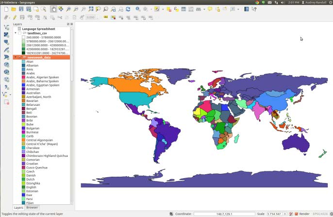
Primary Languages of the World’s Countries in the 1500s. For this map, I used the Categorized style based on the column labeled “Language Spreadsheet_Language.” I used the “random colors” color ramp to delineate each language.