QGIS Tutorial
Quantum GIS (or QGIS, or Quantum Geographic Information System) is a “free, open source geographic information system.” It provides a way for non-programmers to create maps using GIS information.
This tutorial will walk you through the basics of using QGIS to create SOS- formatted maps, by going through the creation of the Earthquakes and Nuclear Power Plants dataset, the Marine Life dataset, the Global Statistics dataset, and a few maps that are not currently part of the SOS collection.
Further Resources
Permalink to Further ResourcesAn excellent set of general tutorials can be found on qgistutorials.com. Thank you to Ujaval Gandhi for providing these to QGIS users free of charge. Additionally, you should read SOS’s Content Creation Guidelines before creating your map. There is a lot of information in there that can save you from having to redo an entire project.
Tips
Permalink to TipsQGIS can be finicky. Please save your project often.
QGIS often has trouble exporting very high resolution images. The SOS team recommends that users use the lowest resolution images that still look good on the sphere — in most cases, that means a resolution of 2048×1024 pixels for simple maps and 4096×2048 pixels for maps with intricate details.
Links for all the data used in this tutorial are provided. In cases where the links are no longer valid, a copy of all the files used is available here:
QGIS Overview
Permalink to QGIS OverviewQGIS, according to its website, is “a user friendly Open Source Geographic Information System (GIS) licensed under the GNU General Public License.” To draw an analogy, it is to making maps what Adobe Photoshop is to editing images. It gives you the ability to create maps from scratch or from imported data, or modify and add to existing maps. The software is set up so that each imported map or map feature is a “layer.” Layers can be made of point locations, background images, polygons such as country borders, or more complex types of vector data, like WMS maps or ESRI shapefiles. While QGIS can manipulate maps, it cannot create data. Users must do that themselves, by manually creating a table of information or (more commonly) importing data from the Web or other sources. The two main categories of maps that QGIS can assemble, along with the type of data required to make them, are below:
- Maps of event locations, such as lightning strikes, earthquakes, tornados, or the locations of tagged animals. These maps require importing a Comma Separated Variable (.csv) file or a text (.txt) file. CSV files are simply spreadsheets that have been saved in a form a computer can easily understand. Contrary to the name, they can be saved with tabs, spaces, or other characters separating the information, not just commas. If you are unsure how your CSV file is organized, simply open it in a text editor such as Notepad to determine what characters separate rows and columns. The information in a CSV file that could be used to create these maps would have to include separated latitude and longitude columns. If the coordinates are in the same column, see Finding/Manipulating Point Data
- Maps of regions colored according to data, such as a map of countries shaded by population. To create this map, you’ll need an ESRI shapefile that includes country borders and names or IDs, as well as a CSV file that has country population by country name or country ID
Usually, maps are made up of a base map (the world map, either an image or a vector map made of polygons such as continents) and overlaying layers of interesting data, such as locations of phenomena. Base maps can be created with vector or raster data. Vector layers can be scaled indefinitely, because they are made up of mathematical algorithms that tell the computer where to draw lines and shapes. Every time you zoom in, the shape just gets redrawn. Raster layers are images. They are composed of pixels, so will lose quality the more they are stretched or zoomed in on.
SOS Format Requirements
Permalink to SOS Format RequirementsBecause of SOS’s high resolution requirements, it is generally easier to have a base map of vector data, which can be scaled indefinitely. Raster, or image, data works if it is high enough resolution, but images of sufficiently high resolution are uncommon.
Additionally, SOS’s software needs to be given a specific map projection in order to render the map correctly on the sphere. In QGIS, this is the default projection: the Equatorial Cylindrical Equidistant projection, also known as WGS 84 or EPSG:4326. While this is a relatively common map projection, it is NOT the one used by anything that Google Maps has made, or anything with Google Maps as a background. There are a lot of tutorials for QGIS that assume a Google Map will be a fine base map, so they tell users how to import that and skip over the instructions for importing anything else.
Because of this limitation, the underlying map layer is a little more complicated when making an SOS map than it is when making a normal map.
Natural Earth Data
Permalink to Natural Earth DataIt is certainly possible to import a vector map in the correct projection. They’re just not very easy to find. A good place to go is Natural Earth Data. Click on the green Get the Data button near the top of the page. From that page, you can download the “Natural Earth quick start kit” or browse the available resources. If you choose to download the quick start kit, you will get a zip file that contains a folder called “packages”. Inside is a .qgs file called “Natural_Earth_quick_start_for_QGIS.” To get started, it’s a fun one to play with.
Other Supported Formats
Permalink to Other Supported FormatsIf you want to find a vector map from another source, QGIS accepts the following forms of vector data:
- KML
- SVG
- GeoTIFF
- GeoJSON
- PostGIS
- SpatiaLite
- MSSQL
- WMS/WMTS
- WCS
- WFS
Start by trying to find data in one of these formats. Websites from NASA, NOAA, and other government agencies will occasionally have mapping data available to the public.
Using an Image
Permalink to Using an ImageIt is also possible to put an image as the base of your map, provided the image is of high enough resolution (2048×1024 or 4096×2048 pixels for SOS). SOS’s FTP server is a good place to find high resolution images that are already in the right format.
Downloading QGIS
Permalink to Downloading QGISQGIS releases new versions often. The version this tutorial is written for is QGIS 2.2, which is no longer the current version. The SOS team recommends that you download QGIS 2.2, which is available at http://www.qgis.org/downloads/. Find the download link that works for your operating system.
Once you’ve clicked the link, the QGIS Setup Wizard should appear. Follow its instructions to download QGIS 2.2. When you click Finish, several icons should have appeared on your desktop with a yellow Q on them. You want to click on the one called QGIS Desktop to open the most sophisticated version of QGIS. QGIS Browser is simply a less versatile version of QGIS Desktop. If these icons do not appear, search for “QGIS Desktop” in the search bar in the Start menu.
Making a Base Map
Permalink to Making a Base MapUsing Vector Data
Permalink to Using Vector DataThe Basic Vector Styling tutorial on QGIS Tutorials walks you through the process of inserting and styling a vector layer in QGIS.
Using an Image
Permalink to Using an ImageLet’s assume you want to use SOS’s “earth vegetation” image as your base map. That image can be accessed from SOS’s FTP server:
- Go to ftp://public.sos.noaa.gov/. Note that this is SOS’s FTP server, where all of their datasets are available for download, not its website. Go directly to that URL
- Click on “land,” then “blue_marble,” then “earth_vegetation,” then click on 2048.jpg
- Right-click and select “Save image as.” It doesn’t matter where, but make sure you save it as a .tif image — we’ll need it in that format. Save the image in a folder you can find again. When the dialogue box appears to save your image in Windows, there will be a field labeled “Save as type.” Click on “All file formats.” Next, add the extension “.tif” to the name of your image. On a Linux machine, you’ll have to delete the original file extension first: for example, replace .jpg with .tif
Creating a World File
Permalink to Creating a World FileNext, we need to create a way for QGIS to interpret this image; the software can’t tell that it’s actually a map until we create something called a “world file.” A world file is an extra file that QGIS knows to associate with an image file, which gives QGIS a set of “coordinates” to put the image at. It tells QGIS how big the image is supposed to be, how to rotate it if at all, and where to place the corners. A world file must have the same name as the .tif image, but its extension is .tfw, for Tiff World File. This is so that QGIS knows which image to associate with which world file.
Open up a text editor (such as Notepad for Windows or Text Editor for Linux machines) and create a blank file. Its name must be the same as your image; only the file extension should be different. For example, if you have an image named 2048.tif, its world file should be called 2048.tfw. Also, please note that even though the file extension is supposed to stand for “TIFF World File”, it’s “.tfw,” not “.twf.” Save it using the Save as feature in the same folder as your image. If the world file is not in the same folder as its image, QGIS won’t be able to find it.
Now, to create the world file, you have to type in information in a way the computer expects it to appear. World files have six lines, which each contain one number:
- Pixel size in X direction (aka image width)
- Y-axis rotation
- X-axis rotation
- Negative of the pixel size in Y direction (aka image height, with a negative sign)
- X coordinate of the CENTER of upper-left most pixel
- Y coordinate of the CENTER of upper-left most pixel
To find this information, we have to know something about our map. First, with the projection we’re in (and with most world maps), there are 360 degrees in the X direction (the map spans the circumference of Earth) and 180 degrees in the Y direction (the map only goes from the North to the South Pole, not around the other side). We also know that our image is 2048×1024 pixels. Knowing this, we can use the following equations:
- Pixel size in X direction
- 360 degrees ÷ 2048 pixels = 0.17578125 degrees per pixel
- Y-axis rotation
- 0
- X-axis rotation
- 0
- Negative of the pixel size in Y direction
- 180 degrees ÷ 1024 pixels × -1 = -0.17578125 degrees per pixel
- X-coordinate of center of upper-left pixel
- -180 degrees + (0.17578125 ÷ 2) = -179.9
- Y-coordinate of center of upper-left pixel
- 90 degrees - (0.17578125 ÷ 2) = 89.9
0.17578125
0.0
0.0
-0.17578125
-179.9
89.9
Contents of our finished world file, 2048.tfw
Type these numbers into your world file, or copy and paste, and save the file.
Adding a Raster Layer
Permalink to Adding a Raster LayerNow go back to QGIS and go to LayerAdd Raster Layer.
Select your image (2048.tif), not the world file. Click OK. A box will appear asking you which CRS (Coordinate Reference System) the data is in. Select WGS 84 and click OK. Once the image is open, QGIS will know to overlay any other data you might want to insert in the right place on the map.
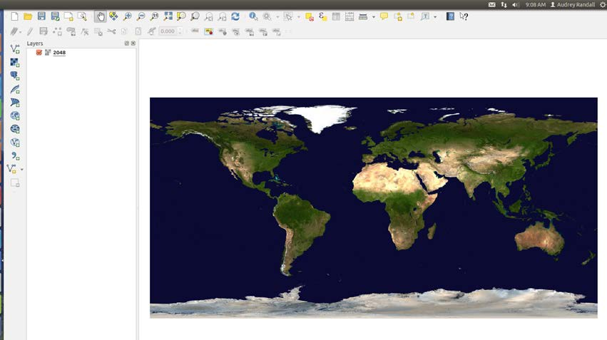
Your map in QGIS should look like this after loading your image.
Once you have more layers, you can reorder layers by clicking and dragging the layer names in the layer bar to the left of the viewing window, to make one appear on top of or below another.
Finding/Manipulating Point Data
Permalink to Finding/Manipulating Point DataFor the purpose of this tutorial, I will create a map with the locations of nuclear reactors plotted against earthquake danger zones.
I’m using a map with a transparent ocean as a base map, so that it’s easy to see what I’m doing during this tutorial. To insert it, see the “Base Maps with Raster Data” section of this tutorial on page 6. I found my reactor data in spreadsheet form on The Guardian’s datablog. To download it, click on the link right under the title that says “Get the data.” This takes you further down the website to a link that says “DATA: Download the full spreadsheet.” Click on that link and save it in a place you’ll remember.
Once you’ve downloaded the spreadsheet, you’ll notice that while it does include coordinates, they have both latitude and longitude in the same column. QGIS won’t be able to plot the data unless latitude and longitude are separate. This is frequently the case with online databases, so I’m going to document the trick I use to separate the column into two.
If you are using a spreadsheet that already has latitude and longitude in separate columns, skip to Adding the Data to QGIS.
Splitting a Column with Google Sheets
Permalink to Splitting a Column with Google SheetsIf you prefer using Microsoft Excel, follow their tutorial on splitting text into different cells and skip down to Adding the Data to QGIS.
- Open a new Google Spreadsheet
- Copy and paste your data into the sheet
- Insert two extra rows next to the coordinates’ column, in the same spreadsheet. Do this by right-clicking on the column header and selecting Insert 1 right. Do this twice
- Click on cell C2. Go to the formula bar located directly above the column headers. Type in the formula =SPLIT(B2, “,”). This will split cell B2 where the comma appears, putting the split halves into cells C2 and D2. It will also make sure the comma isn’t copied into the new cells
- Right-click to copy cell C2. Select the remainder of column C, down to where your data ends. Right-click to paste the formula in C2 into the rest of your selection
- Label your new columns “latitude” first and “longitude” second
- Now go to FileDownload AsComma Separated Values (.csv) to save your spreadsheet
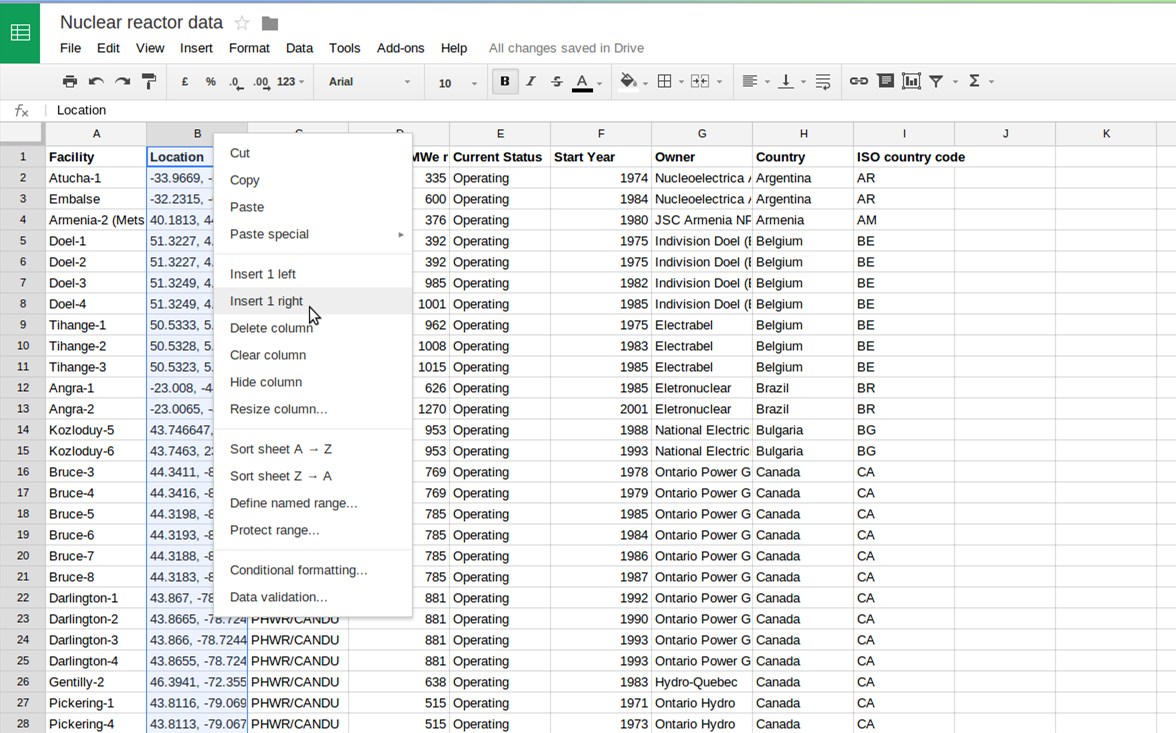
Insert new columns by right-clicking on a column header and selecting Insert 1 right. Use the formula bar (located just above the column headers) to enter the formula to split a column.
Adding the Data to QGIS
Permalink to Adding the Data to QGISIn QGIS, click the add delimited text layer button or go to LayerAdd Delimited Text Layer. Select the file you want to upload (that’ll be our nuclear data file).
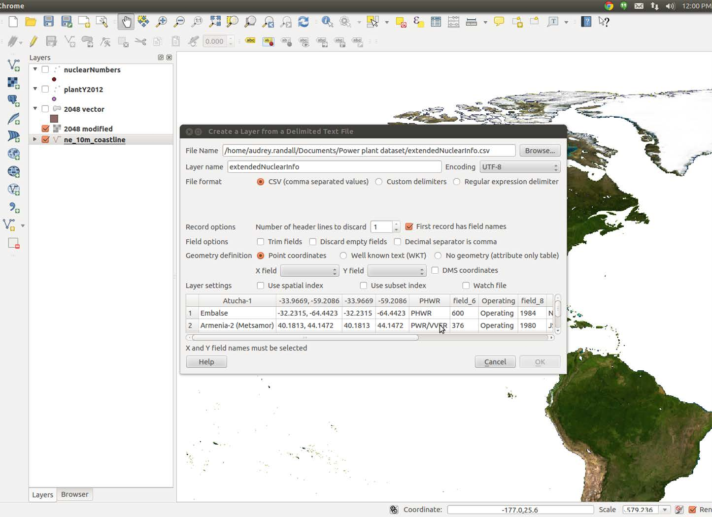
Use the Browse button to choose your data file, then select the columns for your longitude and latitude values for the X field and Y field, respectively.
For the X field, pick the column name for your longitude value (probably “longitude”, if you’re following along with the example). Choose the column containing your latitude value (named “latitude” in my example) for the Y field. Click OK.
A dialog box will come up prompting you to choose your projection. Pick WGS 84 and hit OK. Huzzah, we have a map of reactor locations! For information about how to change the color and style of the points, see the next section.
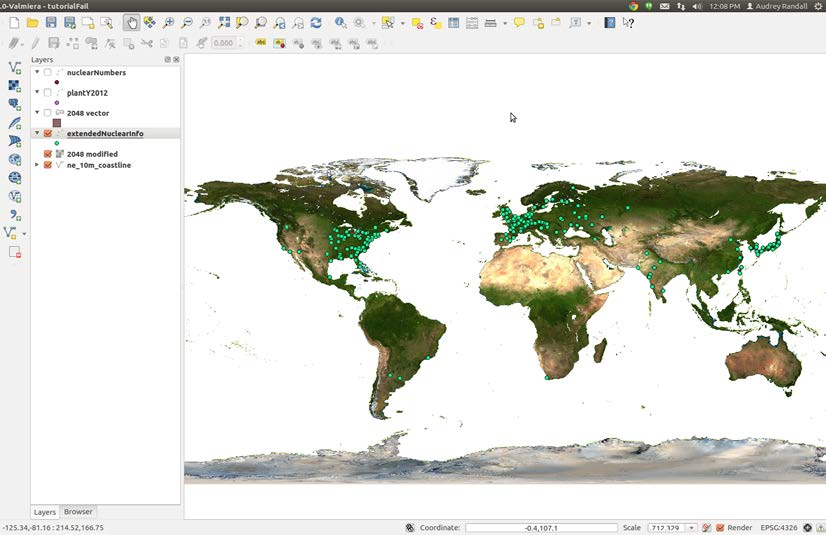
Your map in QGIS should look like this after loading the nuclear reactor data from your CSV
Formatting Point Data
Permalink to Formatting Point DataFor the earthquake layer of this map, I’m going to want something more than just locations of earthquakes — I want to somehow add information like earthquake intensity. The tab delimited variable file I’ve downloaded from NOAA has all that information; we just need to show it.
Download the Earthquake Data
Permalink to Download the Earthquake DataStart by downloading NOAA’s significant earthquake database (which contains “information on destructive earthquakes from 2150 B.C. to the present that meet at least one of the following criteria: Moderate damage (approximately $1 million or more), 10 or more deaths, Magnitude 7.5 or greater, Modified Mercalli Intensity X or greater, or the earthquake generated a tsunami”) from http://www.ngdc.noaa.gov/nndc/struts/form?t=101650&s=1&d=1. Click the link labeled “Download entire significant earthquake database in tab delimited format.” Once it’s downloaded, open the significant earthquake database and save it in a place you’ll remember it.
Import the Data Into QGIS
Permalink to Import the Data Into QGISImport it into QGIS the same way we imported the nuclear reactor dataset, but when the dialog box that asks you to choose the file comes up, look at the field called File format. It has three choices:
- CSV (comma separated values)
- Custom delimiters
- Regular expression delimiter
Choose Custom delimiters. Check the Tab box if it isn’t checked already.
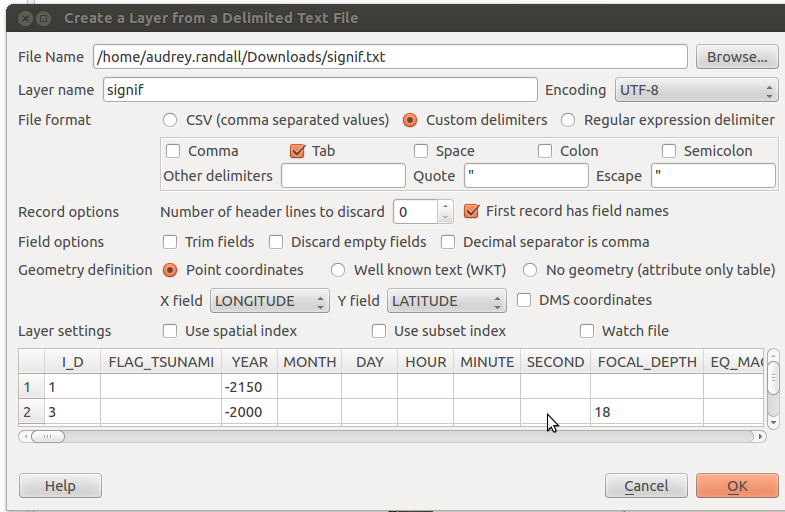
Change the File format option to Custom delimiters and choose the Tab option to import a tab-separated value file.
LONGITUDE and LATITUDE should be in the X field and Y field already. Hit OK. A list of errors may pop up. These are usually due to a missing set of coordinates. You can ignore them for now. Another window will pop up prompting you to choose a CRS: pick WGS 1484 and click OK.
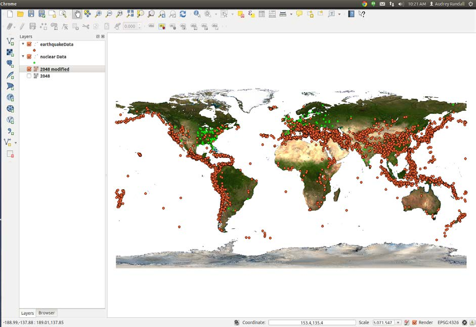
Your map should now look something like this
Color the Earthquake Data by Intensity
Permalink to Color the Earthquake Data by IntensityNow, right click on the layer of earthquake data you just imported and select Properties.
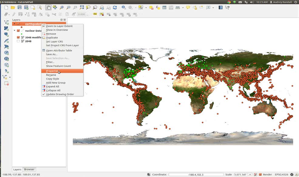
Use the context menu in the Layers panel to access the properties for a layer
You can format your data to make it show attributes. In this case, I want to show the intensity of each earthquake via a color scale. Since my data includes a column labeled “INTENSITY”, I can tell QGIS to assign a color to each point based on what’s in that column. However, if you were to try doing so now, you would notice that a bunch of your data vanishes, because if a point has a null value in “INTENSITY”, QGIS can’t assign it a color, so it gets removed. We can fix this by filtering out everything with an intensity of NULL (which QGIS interprets as having no intensity at all) and making it its own layer.
Dealing With NULL Values
Permalink to Dealing With NULL ValuesRight-click on the layer name of your earthquake data in the layer menu and select Open the attribute table. Click Select using equation, which is the button in the top left corner with an epsilon (ε) on it.
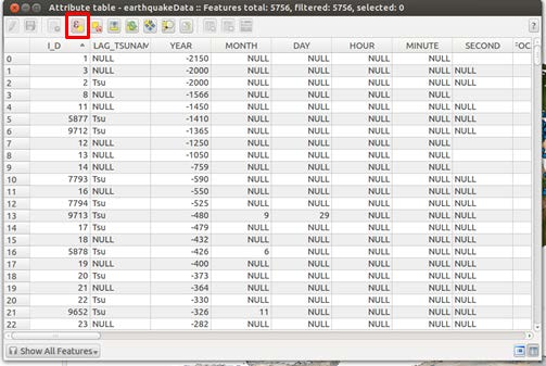
Use the Select using equation button, represented by an icon containing the greek letter epsilon (ε), to select all entries with a NULL intensity value
In the Expression box, type the phrase INTENSITY IS NULL to select the points with null intensities. Then click Select. Some points will now be highlighted in the attribute table, and some points on the map will be a different color (yellow instead of blue, in this example).
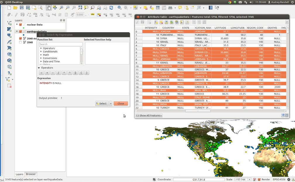
After selecting the data that match the expression INTENSITY IS NULL the rows in the Attribute table are highlighted as well as the points on the map.
Now right click on your earthquake data layer and select Save selection as. You’ll want to click Browse and choose where to save your file — you’ll get an error message if you try to save in the default directory. Check the box that says Add saved file to map, and hit OK. Your selection is now a separate layer that we can format independently, for example, by assigning it a color value that matches the color bar we’re using for the rest of the earthquake points.
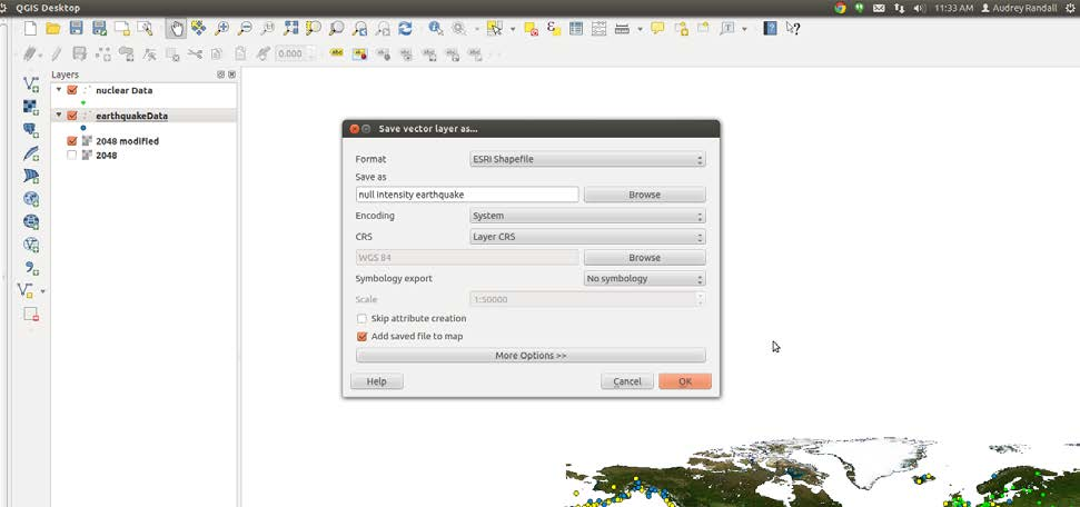
Save all of the earthquakes with NULL intensity to a separate layer
Defining a Color Scale
Permalink to Defining a Color ScaleNow we can reformat our data to give it a color scheme. To do this, go into the Style tab of the Properties window. (Remember that to get to Properties, you right- click on the layer name and select Properties.) First change the button that says Single symbol to Graduated. Next, pick the column you want to be color scaled, which for me is INTENSITY. Pick your color ramp and then click Classify. If you want more than the default five classes, you can adjust the Classes setting found to the right of the Symbol field. A color scale will appear. Click Apply. If you like it, keep it! If not, fool around some more.
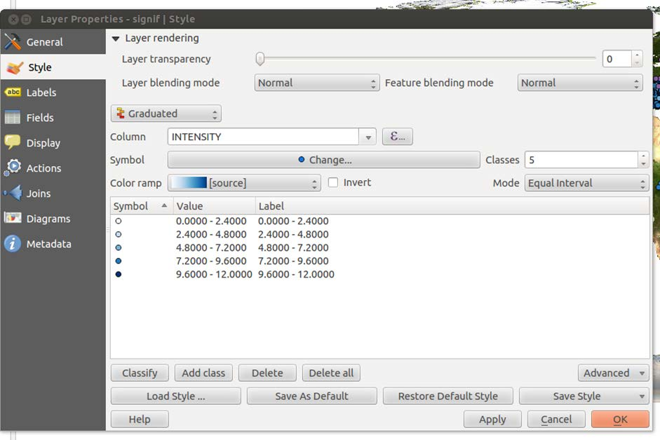
Use the Style tab of the Layer Properties dialog to color your data based on one of its attributes.
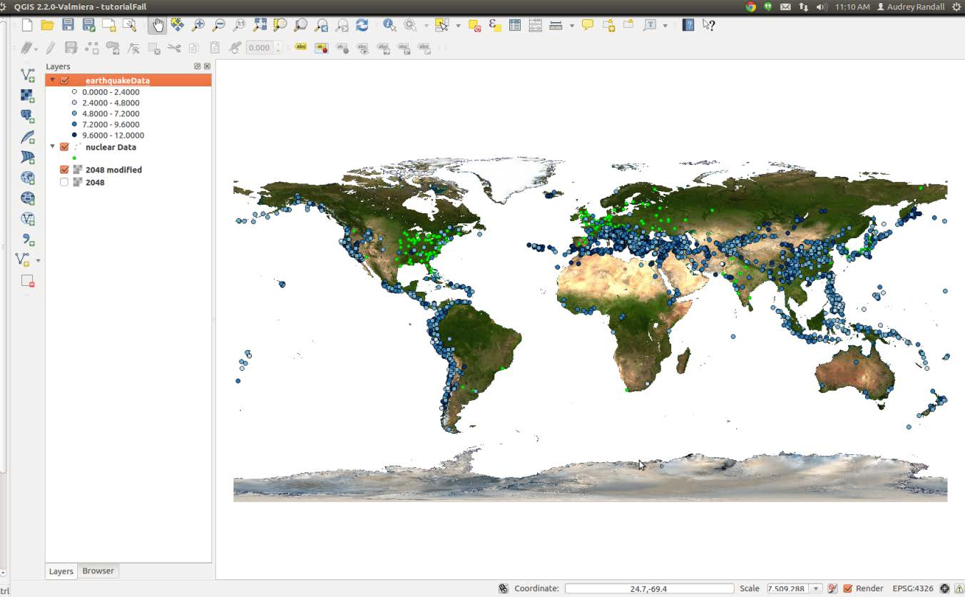
Your map now looks something like this
Making Changes
Permalink to Making ChangesI assigned the null values a light yellow color in the previous step, which isn’t visible at the moment. Those values don’t show up very well on a white background, so I’m now switching back to an image with a blue ocean. I’m going to change the color scheme, and I think I’d like to make the earthquake locations look more blended together, so that they look more like danger zones than individual locations.
So I’m going to click on the Change… button, in the Style tab under Properties. (To get to Properties, remember that you right-click on the layer name and select Properties). Here you can change the marker transparency, shape, and size. You can click on Change… and select the simple marker icon, then set the outline style to no pen to get rid of the outline around the shapes.
You can make all sorts of changes here, so I won’t go into detail. The only thing to remember is that you want your map to be easily read. For example, you can change the shape of the nuclear power plant layer points to differentiate them from the earthquake locations. My results are below. (To export this image, see the Exporting Maps as Images section of this tutorial.)
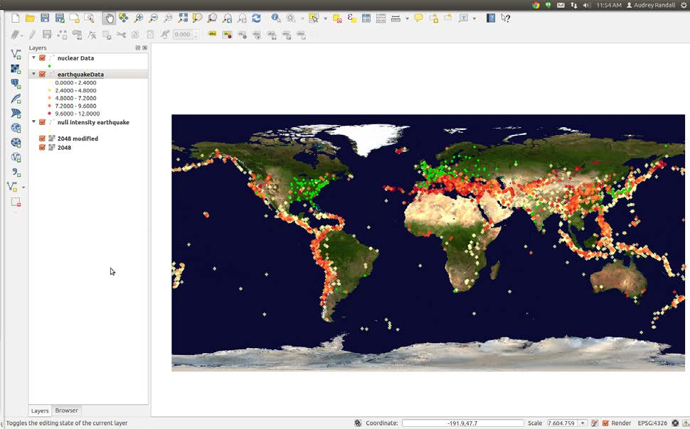
Final version of the map showing the locations of nuclear reactors and earthquakes (colored by intensity)
Making a Choropleth Map
Permalink to Making a Choropleth MapA choropleth map is a map that colors different areas of the map based on some data. The Human Migration - 2010 - 2015 dataset is one example of a choropleth map in the Science On a Sphere® catalog.
Shapefiles
Permalink to ShapefilesSo far, this tutorial has only dealt with one type of data: a spreadsheet, which we use in .csv (comma separated variable) file format. This format is suitable for plotting data in the form of points or locations, but if you want to show data on a per-region basis (such as life expectancy per country), the easiest way to do so is to use an ESRI shapefile.
A shapefile is actually a group of several files that must be kept in the same folder to work. There are a few ways to get them. The first is to simply download a shapefile from one of any number of websites (a list of suggestions is provided below). The second is to create a new shapefile from a spreadsheet or .csv data, which is primarily useful if you can’t find a pre-existing shapefile with the right elements. The easiest way to create your own shapefile is to use CartoDB.com, a mapmaking website. And finally, you can add new data to a pre-existing shapefile by adding columns in the layer’s attribute table.
Getting a Shapefile from the Web
Permalink to Getting a Shapefile from the WebStart by searching for whatever dataset you like as an ESRI shapefile. Some good places to start looking are:
- Natural Earth Data. These datasets are good as base maps, but probably won’t contain data that can be used to color-code regions — these maps are usually just borders. However, if you want a base map composed of vector data, this is a good place to start
- Geocommons. User-submitted maps containing all sorts of data. Search for any kind of map, then click on the “shapefile” button to the right of the map (if available) to download the shapefiles
- MapCruzin. A luck-of-the-draw eclectic collection of maps and shapefiles. Some shapefiles contain data that can color-code countries, such as historical earthquake occurrences per country
For the purposes of this example, I’m going to use the Life Expectancy shapefile from Atlas of the Biosphere. Although this dataset is labeled “Life Expectancy,” it actually has numerous other statistics included in it, such as infant mortality rates, access to safe water per country, etc. You can click on the link that says “Download a GIS grid of this data (ESRI ArcGIS format). This will open up a new page, with a button that says “Download Now.” Click on it.
It will download a zipped file. At the bottom of your screen, a Downloads bar should 21appear with an icon that says “lifeexpectancy.zip.” We need to unzip it, so double click the icon to open the zipped folder. Once the folder opens, you should see all the files inside it. Go up a folder in your file tree so you can see the folder the files are stored in, lifeexpectancy.zip. Right-click it and select “Extract all.” Make sure you extract the files into a location where you’ll be able to find them again.
Loading the Shapefile
Permalink to Loading the ShapefileNow, go into QGIS and start a new project by going to ProjectNew. Click the Add vector layer button. You can also click on the Layers menu at the top of the page and select Add Vector Layer.
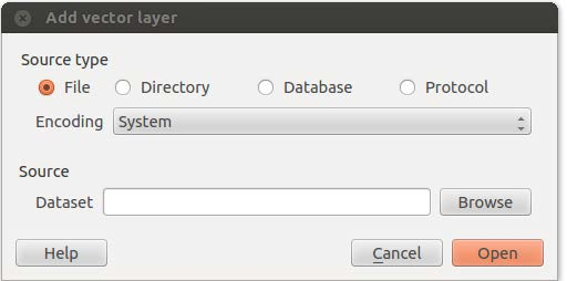
The Add vector layer dialog allows you to choose a shapefile for your Dataset and import it into QGIS.
Click the Browse button next to the Dataset field and navigate to your extracted files. You want to upload the one that has the .shp extension — that’s the actual shapefile. Click Open.
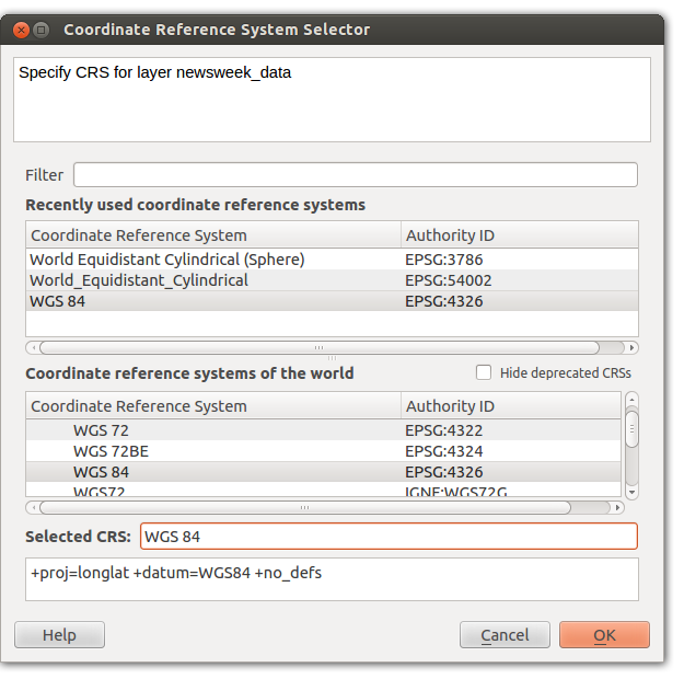
Use the Coordinate Reference System Selector to set your coordinate system to WGS 84.
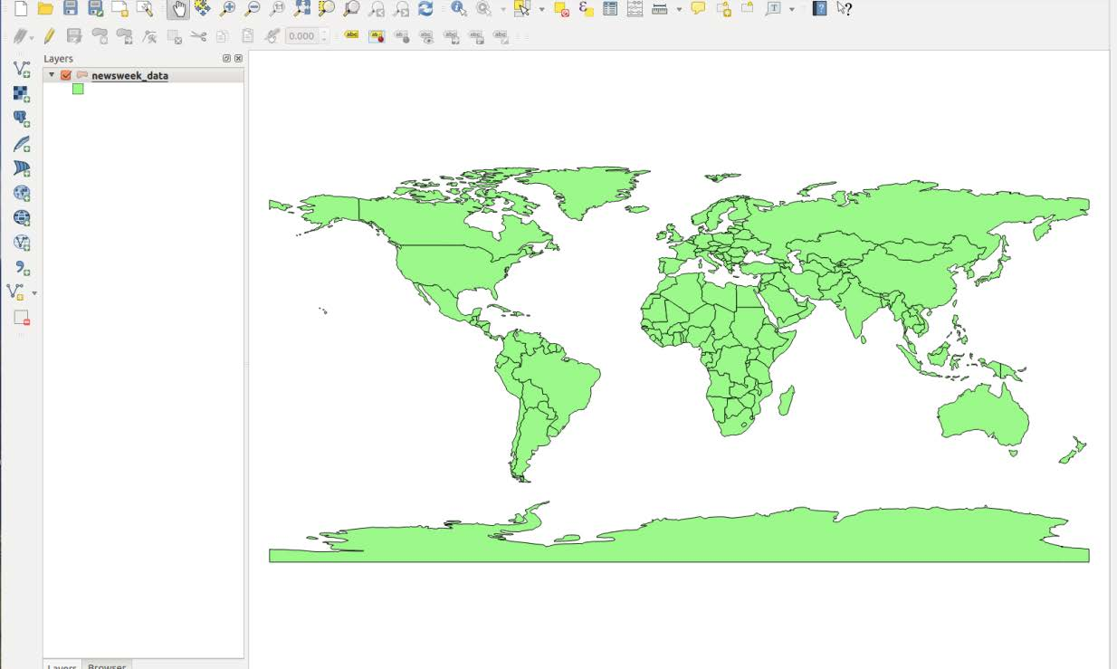
Your map should look like this after loading the Life Expectancy shapefile as a vector layer.
A window will appear asking you to specify the CRS — that’s the Coordinate Reference System. SOS uses WGS 84, also known as EPSG:4326. Select this if it isn’t already selected and click OK.
Styling the Shapefile
Permalink to Styling the ShapefileTo style this shapefile, you’ll want to choose a column of data such as Life Expectancy and tell QGIS to color countries based on the values in that column. In the interest of not reinventing the wheel, please see Ujaval Gandhi’s tutorial on the basic vector styling.
Some points to be aware of:
- Assuming you’ve followed the steps above, you can skip to step 4 of Ujaval’s tutorial. Steps 1–3 are instructions on how to get the data into QGIS
- When you color countries according to values in a column, countries with no values in that column will get grouped with the countries that have the smallest values. QGIS assigns those countries the value “-99” for some reason
- If you only get two colors in your map after assigning it a color scheme, try changing the mode or adding more classes
Once you have styled your map to your satisfaction, please skip to the Exporting Maps as Images section of this tutorial. You’ll also add legends, colorbars, and other map features in that step.
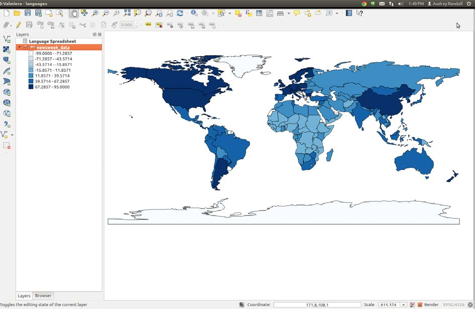
Example of a styled map: access to contraception per country. I used the graduated symbols option with seven equal-interval classes and the “Blues” color ramp to make this map.
Creating a Shapefile Using CartoDB
Permalink to Creating a Shapefile Using CartoDBCartoDB is a website that allows users to upload spreadsheets of geographic information and plot them on a map of the world. Unfortunately, the map CartoDB uses is in the wrong projection to work with SOS (see the write-up on CartoDB for more information), but it’s still a useful tool for converting CSV files to shapefiles. The process of converting text or image information to information that is associated with location coordinates is called georeferencing. CartoDB can do that for us.
Getting CartoDB
Permalink to Getting CartoDBIn this case, getting the mapmaking software is very simple: go to www.cartodb.com and create an account. CartoDB designs plans based on storage space. If you’re importing a lot of data for individual maps, or creating a lot of maps, you’ll need to get one of the paid versions. If not, scroll down past the descriptions of the paid versions and click on “free version.”
For this tutorial I will be using the International Telecommunications Union’s database of landlines and mobile phones registered throughout the world. These files weren’t quite in the format CartoDB can use, so I had to mess with them in Excel first. This is frequently the case with databases on the web, and since this particular spreadsheet’s issues were very specific, I won’t go into how I solved them. If you would like to recreate this dataset, please see the collection of datasets provided along with this tutorial. The file is called Fixed_tel_2000-2012.csv.
To start, go to the green Dashboard button in the top-right corner of the page. This will get you to your dashboard page, where your datasets are stored in table format. Click on the large + button labeled New Table.
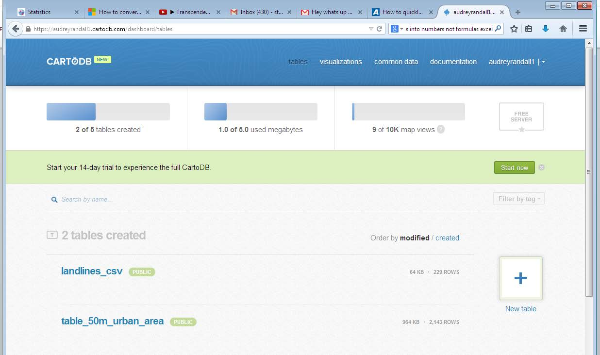
Use the New Table button on the CartoDB dashboard page to upload data files to CartoDB.
Select Select a file, and find the spreadsheet you need. CartoDB can take Excel, CSV, TSV, ESRI Shapefiles, KMLs and KMZs, GeoJSON, GPS eXchange (GPX), OSM and BZ2, OpenDocument Spreadsheets (ODS), and SQL. See the CartoDB documentation for more information. Click Open. Your table will appear.
At the top of the screen, just above your table in the left hand corner, will be the words Table view and Map view. Click on Map view. This window will appear. If it does not, click on the Options button in the top right corner of the screen and select the Georeference option.
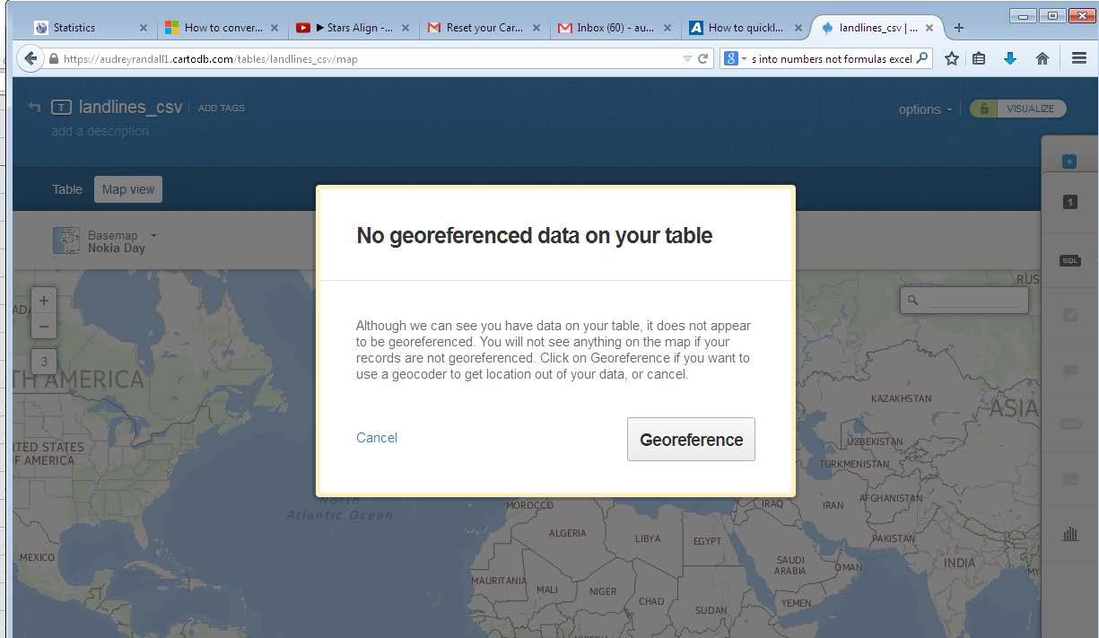
CartoDB will prompt you to georeference the data after you upload it so that it can display the data on a map. Click the Georeference to configure your table.
On the next window that appears, you’ll want to click You have a column identifying administrative regions since our data is referenced by country, not latitude and longitude coordinates. In the In your table the polygons are identified by… field, select field_1. This means that the countries are listed in the field_1 column in your dataset. If you look at the column heading in CartoDB’s Table View over the column with country names, you’ll see that CartoDB has labeled it field_1. You want your data in the World by Countries just like the default settings say, so click Georeference.
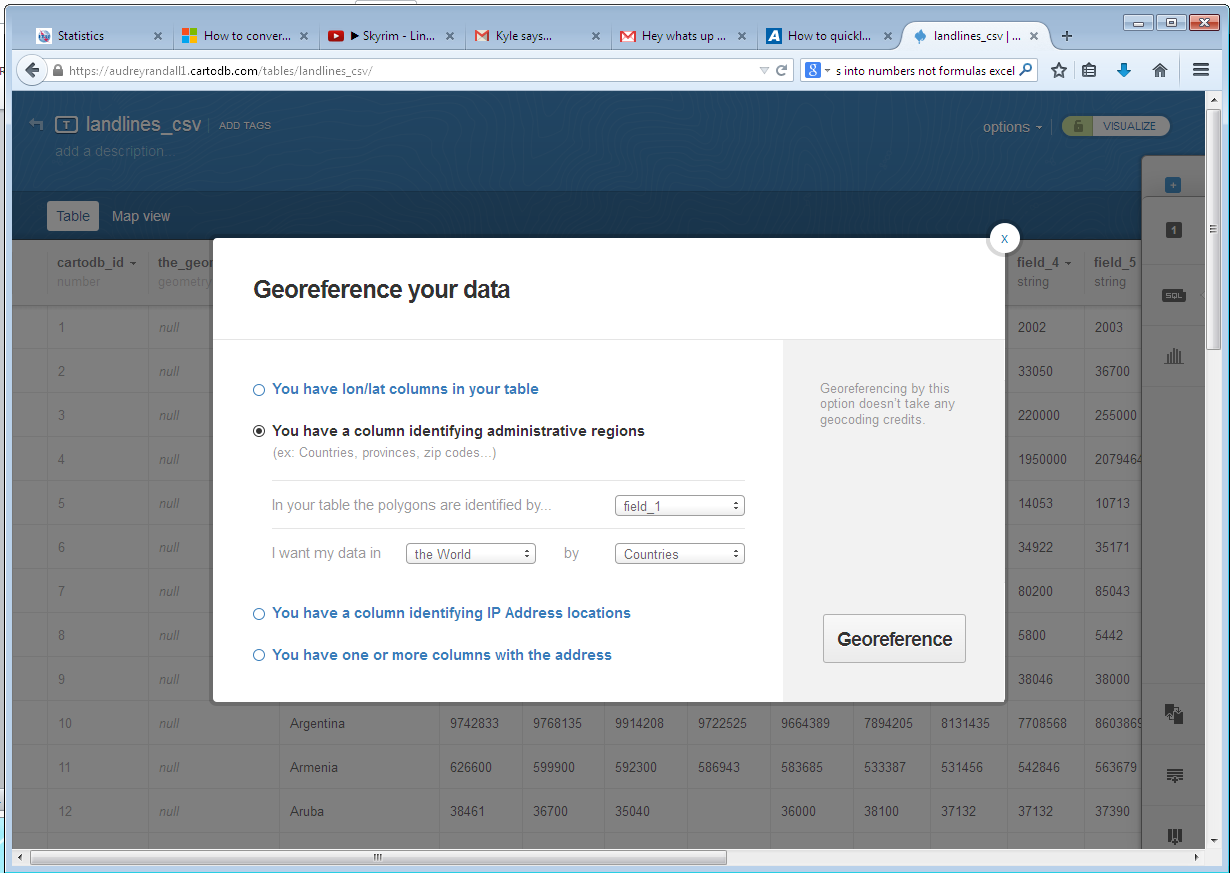
Use the Georeference your data dialog to tell CartoDB which column in your data contains the country names.
A screen will come up with two boxes; one will be greyed out and say No point data available for your selection and the other will say Georeference your data with administrative regions. It should be highlighted. Click Continue. The data will take a minute to render.
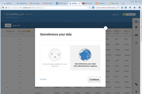
CartoDB has two modes for interpreting geographic data: as points or as administrative regions. In this example, only the administrative regions is relevant.
CartoDB will then give you a message “X out of Y rows were successfully turned into polygons!” If the number of rows turned into polygons was lower than you expected, go through your data in Table view to make sure country names are spelled correctly. If you have rows with no value in field_1 (that’s the column with the country names), CartoDB thinks it’s misreading the rows and will count them along with the rows it couldn’t transform, so check to see if that’s the cause of the discrepancy. If it isn’t, go into Map view and find the countries that aren’t overlaid with a color— these are the ones CartoDB couldn’t parse. For example, Iran in this dataset was labeled as “Iran (I.R.).” CartoDB couldn’t recognize that so I changed it to “Iran” by double-clicking the name to edit the text.
You may have to delete and re-upload your table to make the changes take effect, in which case you should make your changes in the original spreadsheet, save that spreadsheet as a .csv file (or whatever format was originally used), and upload it just as you did before.
Now click on the Options button in the top-right corner and select Export.
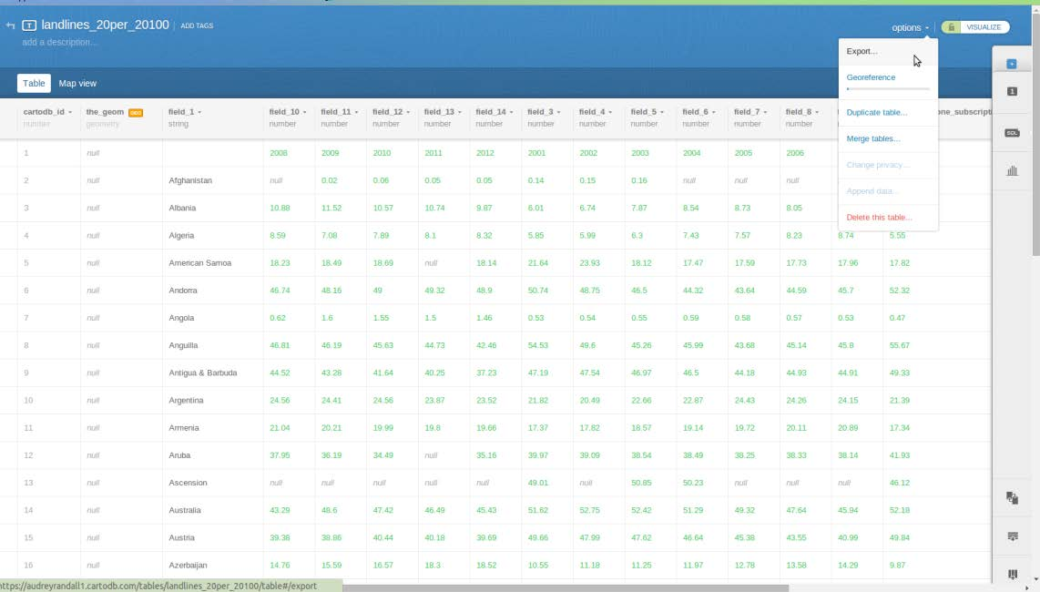
You can find the Export option in Options
Select shp as your file type and save your file in a place you can remember it.
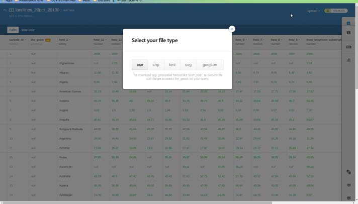
CartoDB offers several different export options. You want shp.
The shapefile will be downloaded onto your computer as a zipped file. Unzip it by right-clicking the file and selecting Extract all. Extract the files into a place where you’ll be able to find them again.
Now that you have a shapefile, you can follow the instructions for the previous section, Getting a Shapefile from the Web, beginning with Loading the Shapefile.
Joining a File to an Existing Shapefile
Permalink to Joining a File to an Existing ShapefileTo “join” a shapefile and a spreadsheet means to add the data in the spreadsheet to the data in the shapefile. For example, if you have a shapefile of countries and a spreadsheet of population data for the same countries, to join the file, you would tell QGIS that the two columns with country names in them should be matched. Then, in addition to the shapefile’s original data for each country, the shapefile will contain the population data as well.
For this example, I will be using the Life Expectancy shapefile from Atlas of the Biosphere. This is the same dataset used in the Getting a Shapefile from the Web section of this tutorial. For the spreadsheet, I will be using the Language Spreadsheet provided by Brown University. It describes the most prevalent language of countries in the 1500s.
To use it as described in this tutorial, simply save it on your computer, then open it. Go to FileSave as. Save the spreadsheet as a .csv file by changing the file extension from .xls to .csv.
First, you need to open the spreadsheet in QGIS. To do so, go to LayerAdd Vector Layer and select the CSV file you just created. Note that you’re not adding it as a delimited text file, which is what we have done in the past. Click Open. It will appear in your Layers bar on the left side of your screen, but no data will appear on your map, since QGIS doesn’t know how to interpret it yet. Please follow the steps in Loading the Shapefile for importing a shapefile to import the Atlas of the Biosphere shapefile. Once you have your shapefile, right-click on it in the Layers panel on the left side of the screen and select Open attribute table.
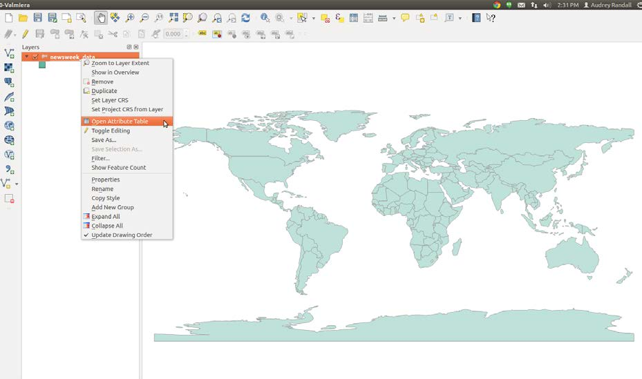
Use the context menu on your layer to open the spreadsheet you’d like to join to your shapefile.
You need to find an identifying column of shapefile data that will match up with a column on your spreadsheet — in our case, we’re looking for the country codes. We’re using those instead of names because QGIS has to see exactly the same word in the spreadsheet as it sees in the shapefile’s data, or it won’t be able to match the two. Differences in abbreviation or spelling errors are easier to avoid if you’re using three letter codes instead of names, since the codes are standardized.
Look through the attribute tables of your shapefile and your speadsheet to find the name of the column that contains the country codes. As it turns out, those are under the column labeled “Code” on the spreadsheet and the column labeled “WB_CNTRY” in the shapefile’s attribute table. Once you’ve found both, close both attribute tables.
Now open the shapefile’s properties window. You can do this by right-clicking the name of the layer in the layer bar to the left and selecting Properties or by simply double clicking the layer name.
Go to the Joins tab and click on the “Add” button.
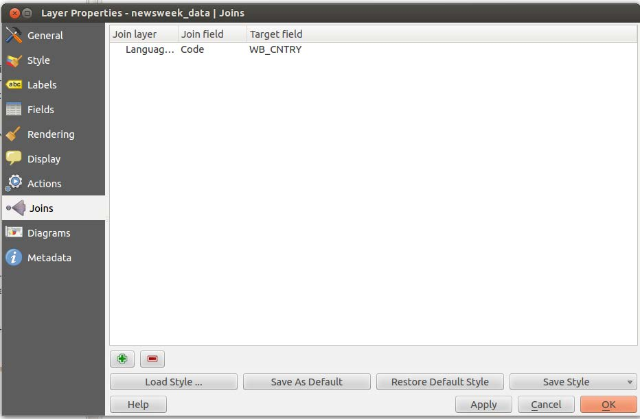
The “Add” button in the Layer Properties dialog is represented by a green plus (+) icon.
A window labeled Add vector join will appear. Select the layer you want to join to the shapefile (our Language Spreadsheet layer), the join field (that’s the column of the spreadsheet, “Code”) and the target field (that’s the column of the shapefile’s attribute table, “WB_CNTRY”). Make sure that Cache join layer in virtual memory is checked. Click OK on the Add vector join window and the Properties window.
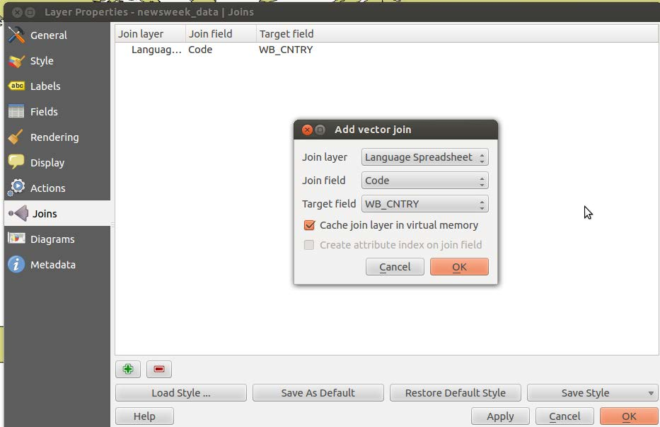
The Add vector join dialog allows you to select the layer you want to join and specify the column in that layer that should be matched against the column in the layer to which it is being joined.
Your shapefile should now have added the information from the spreadsheet to its attribute table. You can check this by simply opening the attribute table by right clicking on the layer name and selecting Open attribute table, then finding the new columns in the table.
From here you can style your data however you like. See Styling the Shapefile for more information.
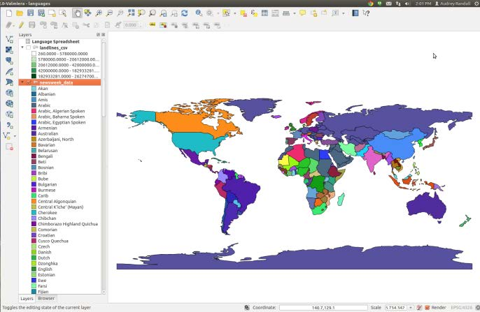
Primary Languages of the World’s Countries in the 1500s. For this map, I used the Categorized style based on the column labeled “Language Spreadsheet_Language.” I used the “random colors” color ramp to delineate each language.
Exporting Maps as Images
Permalink to Exporting Maps as ImagesTo export a map as an image, you use QGIS’s print composer. This is also where you can add titles, compasses, and scales, but due to the nature of our maps, we usually don’t. It’s pretty obvious which way north is on a globe. SOS recommends that you keep any text that must be stationary on the map, like labels, close to the equator, so that it isn’t warped when the map is transformed onto the sphere. However, the preferred way to put legends, images, and labels onto the sphere is to make a PIP (PIP stands for ‘picture in a picture’). For a detailed description of PIPs, please see SOS’s Datasets Manual. For a description of how to create a PIP, see the Legends, Color Bars, and Scales section of this tutorial.
Right-click on your image layer and select Zoom to layer extent. Then go to ProjectNew Print Composer. Name it anything you like.
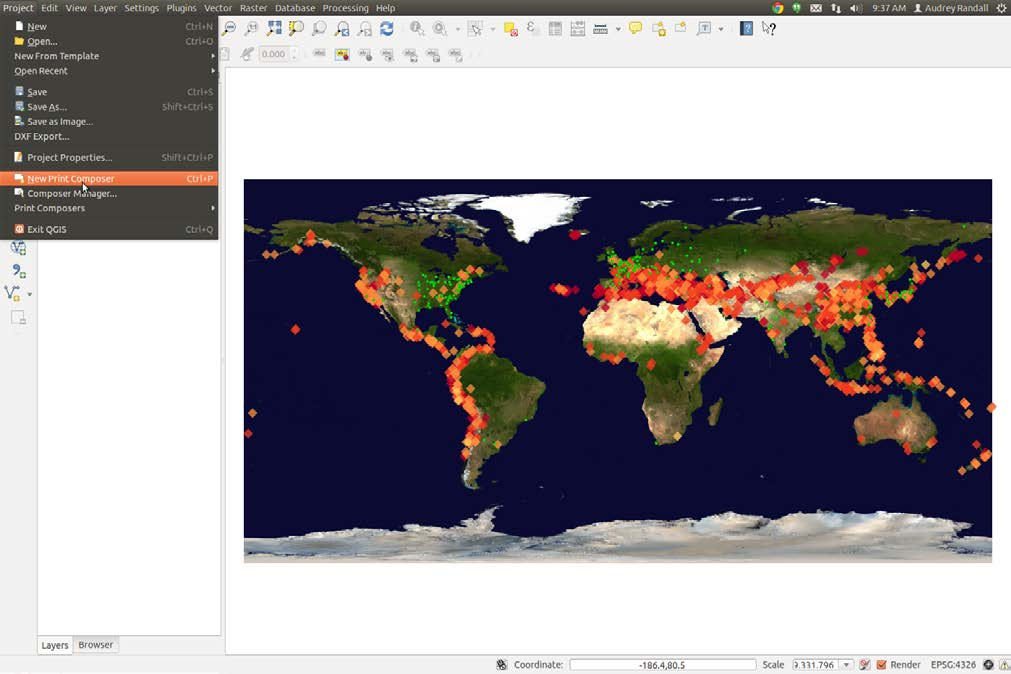
Open the print composer from QGIS’s Project menu
Click on the Add Map button and draw a rectangle that fills the whole white workspace by dragging your mouse across the workspace. Try to make this as exact as you can. Whatever is on QGIS’s main screen will appear in the box.
If you want to change what’s appearing in your map box, you can change it in the main QGIS window, and then click the Update button under Item Properties. Whatever you most recently clicked on in the composer will get updated. For example, if you have a legend and a map arranged in the composer, only the one that you last clicked on will get updated.
Now look at the menus on the right. First, next to Presets under the Composition tab will be a box with a preset paper size in it. Click on it and select Custom. Then change the width and height to 6.84 inches and 3.41 inches, respectively. This is because we want our export resolution to be 300 dpi (dots per inch, or pixels per inch) and we want the final resolution of our map to be 2048x1024. 2048 divided by 300 is approximately 6.84, and 1024 divided by 300 is 3.41. You’ll probably have to change the units to inches instead of mm. Make sure your export resolution really is at 300 dpi.
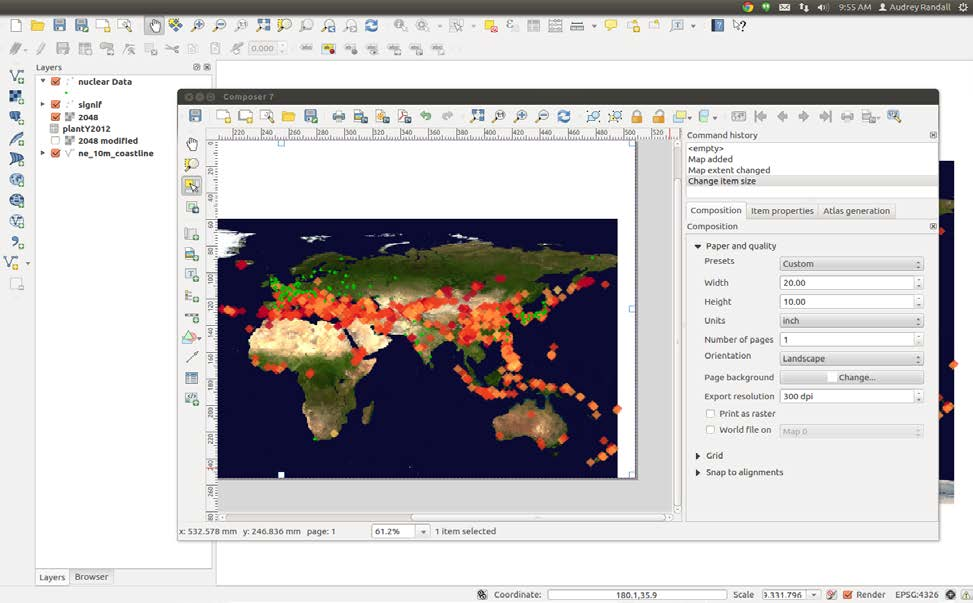
Use the Composition in the print composer to define the size of the image you export.
Click the Item properties tab, then scroll down to Extents. To make your map fill the screen as much as possible, change the X values to -180 and 180, and the Y values to -90 and 90. You should see the map fill the entire white space. Check the Scale value under Item Properties. For a map sized 6.84 by 3.41 inches, resolution 300 dpi, the scale should be 114891360. If this is incorrect, it causes problems with the export. Then click the Export as Image button. SOS prefers JPEG or PNG, but can accept most common image formats. Congratulations, you have an SOS-ready map!
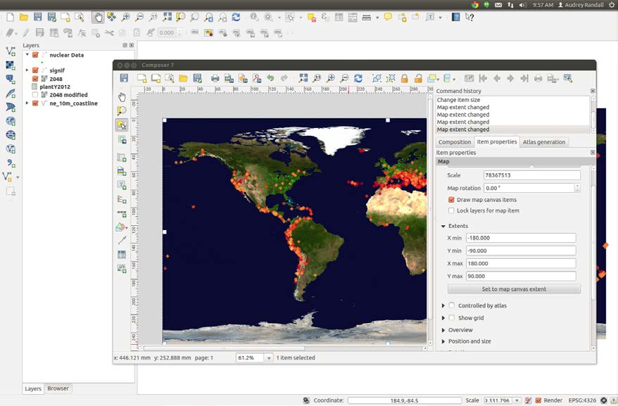
Set the Extents for your map to ensure it fills the entire image.
Legends, Color Bars, and Scales
Permalink to Legends, Color Bars, and ScalesSOS recommends that users create labels, legends, and text in the form of “PIPs,” (picture in a picture) which are images that can be projected on the sphere. This makes it possible to avoid the warping that would accompany text placed directly on a map, since the closer to the poles the text is, the more it is warped when it is projected onto the sphere.
QGIS allows you to create PIPs using the print composer. This tutorial is a good resource for learning to create most common map accessories. Once you have a legend that you like, you should save it as a separate image. You can accomplish this by unchecking all of your map layers so that none of them are visible in the print composer (note that you have to have them visible when you open the composer, or the legend won’t be created in the first place), and then exporting the image as a PNG. You may want to crop it down in an image editor such as GIMP or a Microsoft Office product like Word or PowerPoint.
For example: if I wanted to create a legend for my earthquake data, I would first open the print composer with one or more earthquake layers visible and create a legend as described in the tutorial that was linked to above. Then I would uncheck all the layers and click Update under the Item Properties tab to ensure that the legend is the only thing visible in the print composer, and click Export as Image.
Exporting Maps as Layers
Permalink to Exporting Maps as LayersSometimes it can be advantageous to have all the layers of your map as separate image files, so that they can be turned off and on as you wish. For example, I’m saving the nuclear power plant locations as a separate PNG from the earthquake data, in case some users just want to talk about one or the other. To save the layers of your map as separate files, simply uncheck the boxes next to each of the layers that you don’t want visible, and arrange the remaining layer(s) for the print composer just as you would for a full map (For guidance on how to do this, please see the section labeled Exporting Maps as Images.)
I also want to create layers of different years of earthquake data, because I have data from four thousand years ago and it would be neat to show the earthquakes accumulate, layer by layer. I’m going to split it up into chunks of 200 years. To do so, I’m going to create a layer of data for each one, and then I’m going to arrange each layer in the print composer.
Splitting Data
Permalink to Splitting DataTo split up the layers of data, right-click on the layer name and select Open attribute table. Click on Select features using an expression. If you don’t remember from the steps above, that’s the button at the top that has an epsilon (ε)on it. In the Expression window, we need to tell QGIS to select all the elements of column YEAR that have values within a certain range. The formula to do so is "YEAR" <= -2000. Type this into the Expression window.
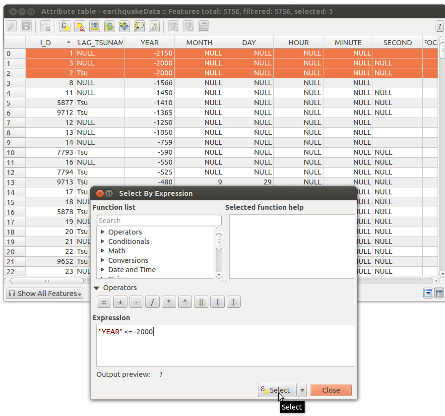
Use the Select By Expression to select rows based on the YEAR column.
To explain what this formula means: We want to select the values in the YEAR column, by putting the column name in quotes (without the quotes, QGIS thinks you’re referring to the column itself, rather than each value within the column). The first range of years we’re selecting is anything older than 2000 BCE, so we use the formula “YEAR” <= -2000 to say “The values in column YEAR that are less than (<) or equal to (=) -2000.”
Once you have a selection, right-click on the layer name and click Save selection as. Save as an ESRI shapefile in a folder you’ll remember and import the resulting layer to QGIS by checking the Add saved file to map and pressing OK.
Next, we need to select values between two numbers. We do so by adding the keyword AND to tell QGIS to find points that satisfies both conditions. To find earthquakes between the years 2000 and 1800 BCE, not including 2000, the expression is “YEAR” > -2000 AND “YEAR” <= -1800. Note that “YEAR” > -2000 AND <= - 1800 is not a valid statement.
Repeat these steps as many times as you need. For this map, since our color style drops any point with an intensity value of NULL, I’m also making a layer with the command “INTENSITY” IS NULL added onto my year specifications for each set of 200 years, like so: “YEAR” > -2000 AND “YEAR” <= -1800 AND “INTENSITY” IS NULL.
Styling Each Layer
Permalink to Styling Each LayerSince it would be a pain to go through and redo the color style for each layer, I’m going to go to Properties (right-click layer name and select Properties) for my earthquakeData layer and save the style I’m using as a QGIS layer style file. I’ll do the same on the null intensity layer. As a result, I can use the Load Style… button to copy those styles to any other layer.
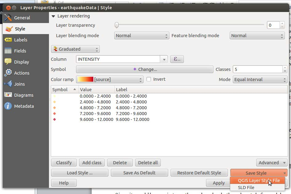
You can save the style of a layer as a separate file for reuse in the Style tab of the Layer Properties dialog.
However, this method seems to be a bit buggy, so another, simpler way to do this is to right-click a layer and select Copy Style, then right-click the new layer and select Paste Style.
Exporting Layers
Permalink to Exporting LayersOnce all the layers are created, it’s time to export them all as PNGs. Remember to save them with useful names! See the Content Creation Guidelines for nomenclature guidelines. Arrange your images in the Print Composer the same way we did for a full map, but this time, make sure that only the layers you want to export are visible in QGIS’s main window. Make sure that you right-click on one of the layers that covers the full extent of the map, like the background image layer, and select Zoom to layer extent, or your points will be in the wrong places.
You can use one composer to export all your images; just select the layers that you want in each one and press the Update preview button on the Item Properties menu. See the Exporting Maps as Images section of this tutorial for detailed instructions.
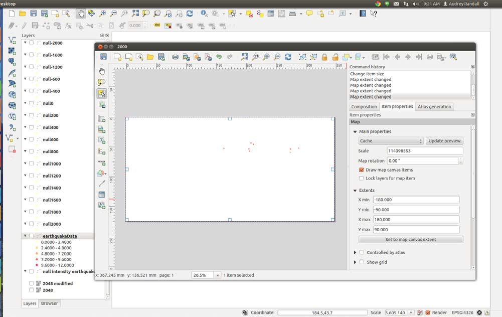
Export an individual layer by toggling the visibility of all other layers off and exporting it with your print composer.
Remember to make sure that your DPI is set to 300, your paper size is custom and set to 6.83 by 3.41 (this gives us the correct pixel size of approximately 2048 by 1024), and your Extents are set to -180, -90, 180, and 90.
Making Image Backgrounds Transparent
Permalink to Making Image Backgrounds TransparentTo make the map layers’ backgrounds transparent, you need image editing software. This tutorial will cover how to do so with GIMP, which is an open source image editor and can be used on either Windows or Linux. If you have access to Adobe Photoshop, that works too.
Download GIMP from the project website. Follow the instruction in the setup wizard. When you open it (you can do so by going to the start menu and searching for it) it won’t be full screen. If you want to set the transparency of one image, this is all you need, but if you want to batch process a bunch of images (we do), you’ll need to install the plugin BIMP as well.
Installing BIMP for Batch Processing
Permalink to Installing BIMP for Batch ProcessingDownload BIMP from the project website. Once you’ve downloaded the file, you’ll end up with a zip file in your Downloads folder, which you’ll need to extract into GIMP’s plugins folder. To do so, right-click the BIMP zip file, select Extract all, and in the box that says Files will be extracted into this location, browse until you find GIMP’s plugins folder. In Windows, that should be found at the file path C:\Users\your_user_name_here.gimp-2.8/plugins. So to find it, go to the folder Computer, then Disk C: (your local hard drive), the folder Users, then the folder with the same name as your username, then to the folder labeled gimp 2.8, then the folder called plugins. Select the plugins folder and click OK. Once you’ve done that, open the plugins folder by going to the Start menu, clicking on Computer, and following the file path above. Once you’re in the plugins folder, go to bin\win32 and copy everything in win32. Paste it back into the main plugins folder. Your plugins folder should now look like this:
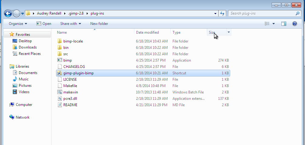
After installing the BIMP plugin your GIMP plugins folder should look something like this.
Removing the White Background From Your Images
Permalink to Removing the White Background From Your ImagesNow, open GIMP. When you click File, you should see the option Batch Image Manipulation. Click on it. In the Manipulation Set box, click the Add icon to add a new transformation. A menu will appear; select Other Gimp Procedure….
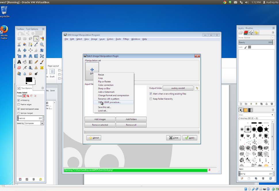
Select Other GIMP Procedure… in BIMP to remove the white background from your images.
Select plug-in-colortoalpha in the list of available procedures, then click on the Color to remove button. In the color picker window that opens up, set the Color name to #FFFFFF (this is the hexadecimal code for the color white). Click OK in the Pick a Color window and the Other GIMP procedure… window. This should return you to the Batch Image Manipulation Plugin window.
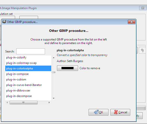
Use GIMP’s color-to-alpha plugin to convert white pixels to transparent pixels in your images.
In the original Batch Image Manipulation Plugin window, click Add images. This is not the same button as the Add button you just used to pick the color to remove from your images. Select the images you want to manipulate and click Add.
Click Apply. For some reason, I had to click Apply three times before my images actually became transparent, and they only did so when saved to a new folder. I’m not sure what was going on there. But that should be good — you now have your layers of earthquake data, in transparent PNG format!
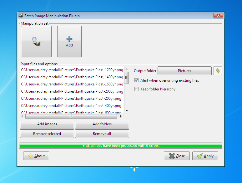
After processing all of your exported map layers, the BIMP window looks something like this
Connecting Points of Data With Lines
Permalink to Connecting Points of Data With LinesSometimes it’s useful to be able to connect the dots of a dataset, such as in the case of animal locations. QGIS doesn’t provide this functionality on its own; we have to download a plugin to do it for us. For this example, we are going to use the leatherback turtle track information provided by www.topp.org, the Tagging of Pelagic Predators project’s website. You can download the file or find it in the project files for this tutorial. The file name is leatherback 41708.txt.
Installing PointsToPaths Plugin
Permalink to Installing PointsToPaths PluginOpen QGIS. At the top of the window, go to PluginsManage and Install Plugins, then search for Points to Path and click Install. Please note that if you search for Point to instead of Points to the plugin will not appear in the menu.
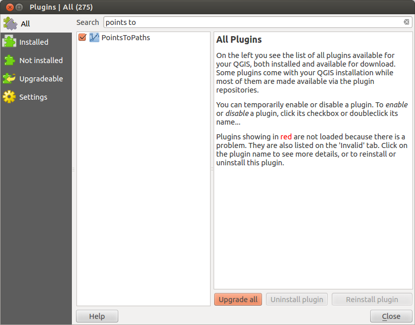
Install PointsToPaths from the QGIS Plugins dialog.
You can now run the plugin from PluginsPoints to PathsPoints to Paths.
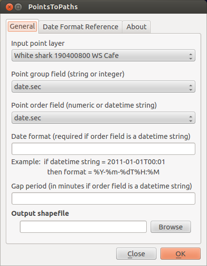
After running Points to Paths you will see a window like this.
Currently, it’s on the General tab. There are also a Date Format Reference tab, which will be useful later, and an About tab.
Using PointsToPaths
Permalink to Using PointsToPathsOn the General tab, there are six fields:
- Input point layer
- Point group field
- Point order field
- Date format
- Gap period
- Output shapefile
Input point layer
Permalink to Input point layerThe layer of points that you want to connect. In our case, this is the turtle tracking layer.
Point group field
Permalink to Point group fieldThe plugin is looking for a column that has the same character(s) for all the points that will be part of one path. The software just needs to know which points it should add to the line, so it asks for a column with a com- mon identifier. For example, if I have a spreadsheet that contains location infor- mation for one leatherback turtle, I would need an identifying column that has the number 1(or any other character) in it for every row of data. If I had a spreadsheet with information for two turtles, turtle 1 would have the number 1 in the identification column, and turtle 2 would have the number 2, so that Points to Paths knows to make two paths for the data.
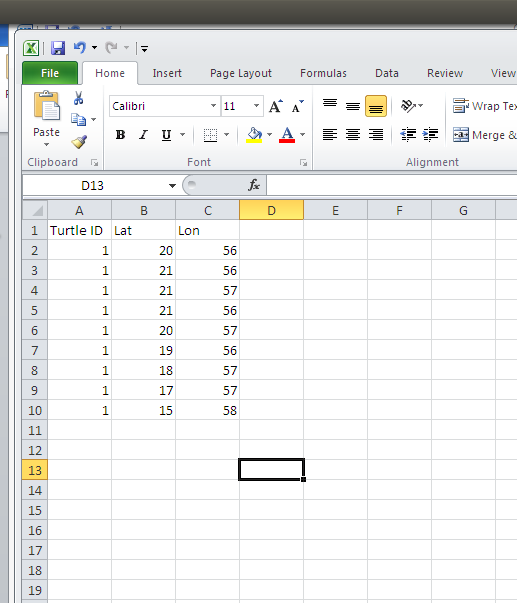
Example for one leatherback turtle.
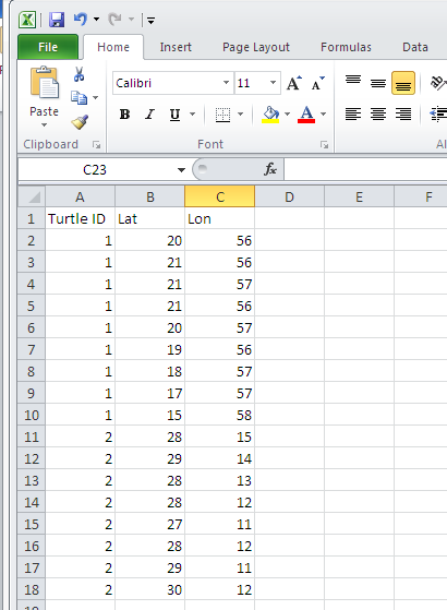
Example for two leatherback turtles.
Point Order Field
Permalink to Point Order FieldThe point order field is the field that tells the plugin which order to connect the points in. What the plugin wants you to do is specify a column that has the date the location measurements were taken. For our data, and possibly in other spread- sheets, you may run across a column called “date.sec” that doesn’t look like a recognizable date format. A computer will be able to use that information without being told what format it’s in, so if you pick the date.sec column for the point or- der field, leave the date format field blank. However, most of the time, you’ll have a more traditional date column. In this case, you’ll need to tell the plugin what format it’s in in the following column.
Date Format Field
Permalink to Date Format FieldThe date format field’s purpose is to tell the plugins which format your date in- formation is in. For example, say you have a date column in the format MM/DD/YYYY. (To determine the format of your spreadsheet’s date column, right-click on the layer name and select Open attribute table. You’ll be able to see the column that has your date info.) The plugin needs to know that the first number it reads is the month, the second is the day, and the third is the year. It also needs to know that a number ends when it is followed by a “/” symbol. So we type in the symbols %m/%d/%Y, which basically translates our date into a format the plugin can read. %m means month, %d means day, etc. See the Date Format Reference tab at the top of the plugin’s window, it will give you the codes needed to identify each type of date information.
Gap Period
Permalink to Gap PeriodYou don’t need to worry about this field for this dataset.
Output Shapefile
Permalink to Output ShapefileUnder the Output shapefile field, select a name for the animal track you’re creating. You can use Browse to pick a folder to save it in. The animal track will be saved as a shapefile at this path.
Creating Your Shapefile
Permalink to Creating Your ShapefileAfter you’ve filled in all of the above fields in the PointsToPaths dialog, click OK on the plugin window, a window will pop up asking you if you want to import the new shapefile. If you click Yes and the shapefile doesn’t appear, simply import it as a vector layer manually. (See the Using Vector Data section of Making a Base Map in this tutorial.) It will be saved in your top directory, unless you specified a file path while naming your output shapefile. A line that goes through your points will appear on your map.