Formatting Point Data
For the earthquake layer of this map, I’m going to want something more than just locations of earthquakes — I want to somehow add information like earthquake intensity. The tab delimited variable file I’ve downloaded from NOAA has all that information; we just need to show it.
Download the Earthquake Data
Permalink to Download the Earthquake DataStart by downloading NOAA’s significant earthquake database (which contains “information on destructive earthquakes from 2150 B.C. to the present that meet at least one of the following criteria: Moderate damage (approximately $1 million or more), 10 or more deaths, Magnitude 7.5 or greater, Modified Mercalli Intensity X or greater, or the earthquake generated a tsunami”) from http://www.ngdc.noaa.gov/nndc/struts/form?t=101650&s=1&d=1. Click the link labeled “Download entire significant earthquake database in tab delimited format.” Once it’s downloaded, open the significant earthquake database and save it in a place you’ll remember it.
Import the Data Into QGIS
Permalink to Import the Data Into QGISImport it into QGIS the same way we imported the nuclear reactor dataset, but when the dialog box that asks you to choose the file comes up, look at the field called File format. It has three choices:
- CSV (comma separated values)
- Custom delimiters
- Regular expression delimiter
Choose Custom delimiters. Check the Tab box if it isn’t checked already.
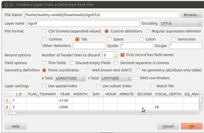
Change the File format option to Custom delimiters and choose the Tab option to import a tab-separated value file.
LONGITUDE and LATITUDE should be in the X field and Y field already. Hit OK. A list of errors may pop up. These are usually due to a missing set of coordinates. You can ignore them for now. Another window will pop up prompting you to choose a CRS: pick WGS 1484 and click OK.
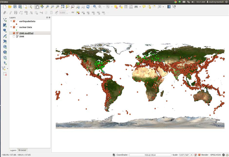
Your map should now look something like this
Color the Earthquake Data by Intensity
Permalink to Color the Earthquake Data by IntensityNow, right click on the layer of earthquake data you just imported and select Properties.
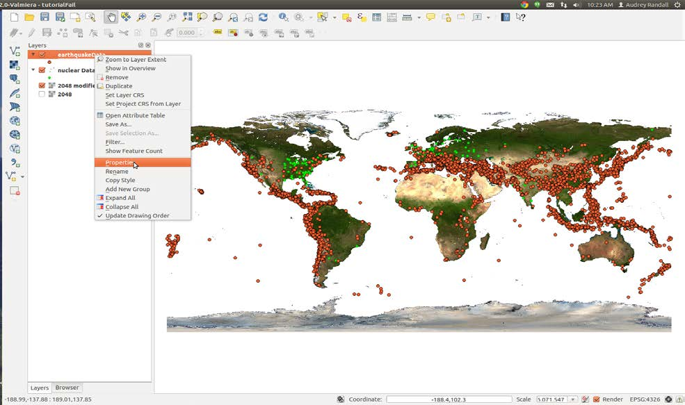
Use the context menu in the Layers panel to access the properties for a layer
You can format your data to make it show attributes. In this case, I want to show the intensity of each earthquake via a color scale. Since my data includes a column labeled “INTENSITY”, I can tell QGIS to assign a color to each point based on what’s in that column. However, if you were to try doing so now, you would notice that a bunch of your data vanishes, because if a point has a null value in “INTENSITY”, QGIS can’t assign it a color, so it gets removed. We can fix this by filtering out everything with an intensity of NULL (which QGIS interprets as having no intensity at all) and making it its own layer.
Dealing With NULL Values
Permalink to Dealing With NULL ValuesRight-click on the layer name of your earthquake data in the layer menu and select Open the attribute table. Click Select using equation, which is the button in the top left corner with an epsilon (ε) on it.
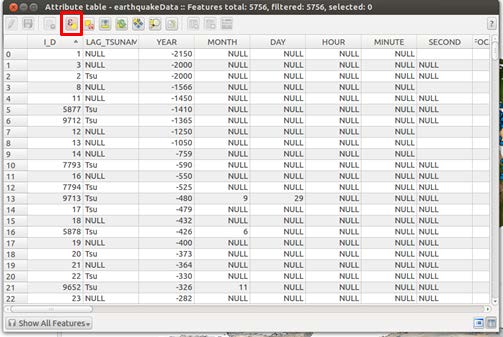
Use the Select using equation button, represented by an icon containing the greek letter epsilon (ε), to select all entries with a NULL intensity value
In the Expression box, type the phrase INTENSITY IS NULL to select the points with null intensities. Then click Select. Some points will now be highlighted in the attribute table, and some points on the map will be a different color (yellow instead of blue, in this example).
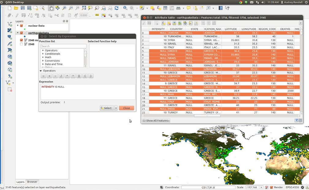
After selecting the data that match the expression INTENSITY IS NULL the rows in the Attribute table are highlighted as well as the points on the map.
Now right click on your earthquake data layer and select Save selection as. You’ll want to click Browse and choose where to save your file — you’ll get an error message if you try to save in the default directory. Check the box that says Add saved file to map, and hit OK. Your selection is now a separate layer that we can format independently, for example, by assigning it a color value that matches the color bar we’re using for the rest of the earthquake points.
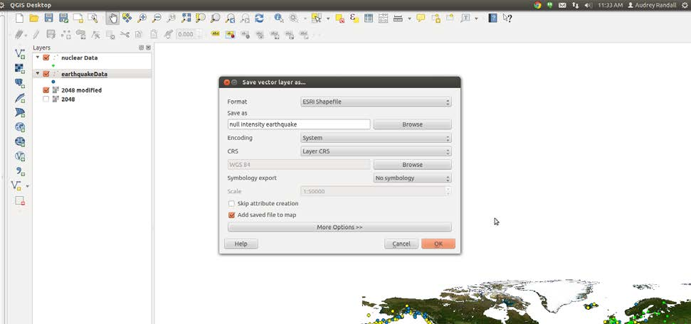
Save all of the earthquakes with NULL intensity to a separate layer
Defining a Color Scale
Permalink to Defining a Color ScaleNow we can reformat our data to give it a color scheme. To do this, go into the Style tab of the Properties window. (Remember that to get to Properties, you right- click on the layer name and select Properties.) First change the button that says Single symbol to Graduated. Next, pick the column you want to be color scaled, which for me is INTENSITY. Pick your color ramp and then click Classify. If you want more than the default five classes, you can adjust the Classes setting found to the right of the Symbol field. A color scale will appear. Click Apply. If you like it, keep it! If not, fool around some more.
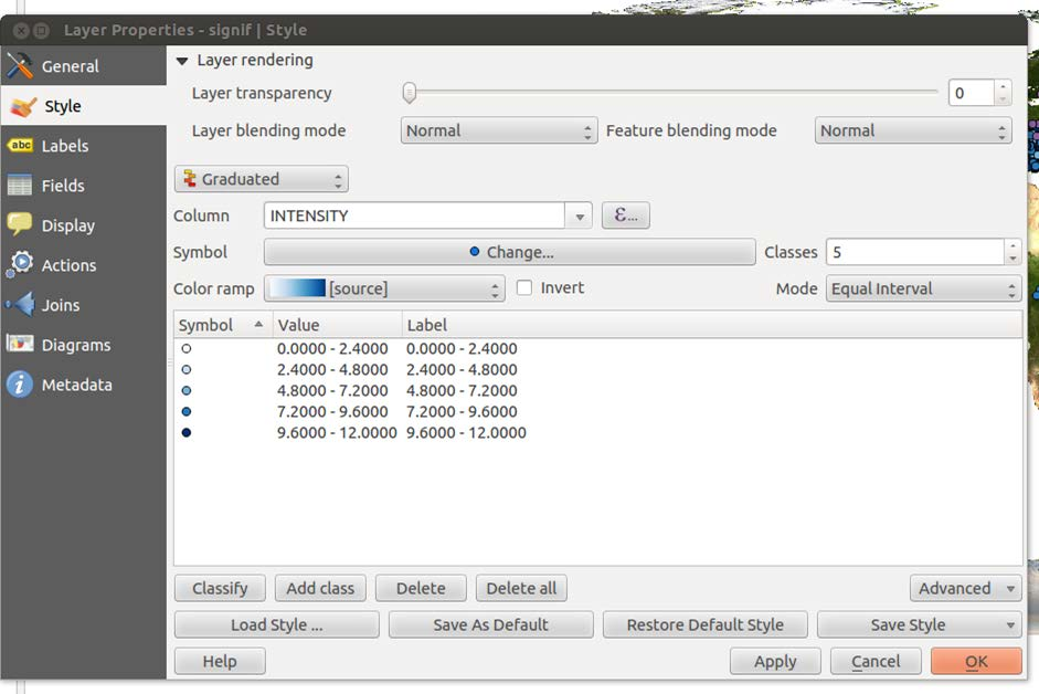
Use the Style tab of the Layer Properties dialog to color your data based on one of its attributes.
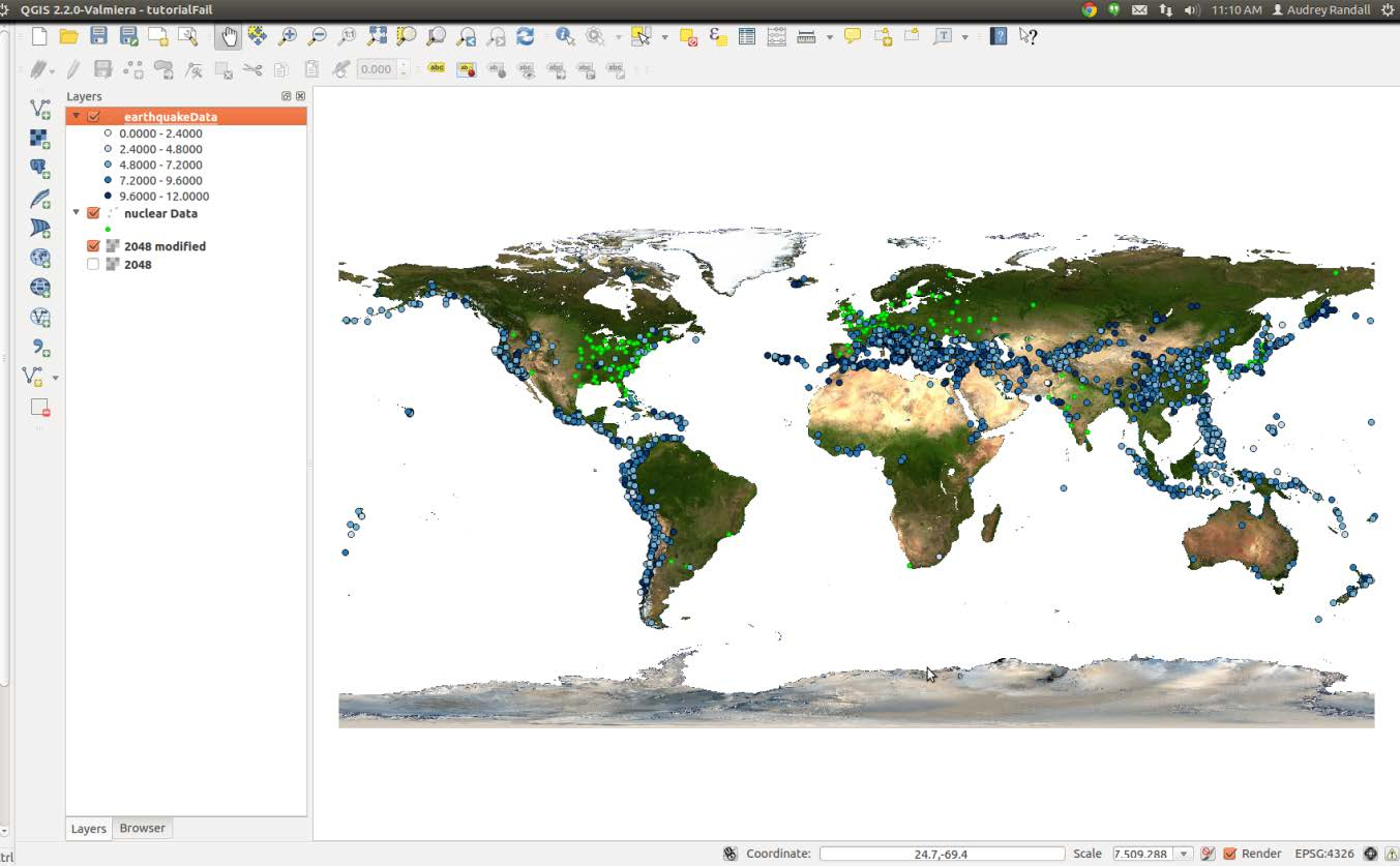
Your map now looks something like this
Making Changes
Permalink to Making ChangesI assigned the null values a light yellow color in the previous step, which isn’t visible at the moment. Those values don’t show up very well on a white background, so I’m now switching back to an image with a blue ocean. I’m going to change the color scheme, and I think I’d like to make the earthquake locations look more blended together, so that they look more like danger zones than individual locations.
So I’m going to click on the Change… button, in the Style tab under Properties. (To get to Properties, remember that you right-click on the layer name and select Properties). Here you can change the marker transparency, shape, and size. You can click on Change… and select the simple marker icon, then set the outline style to no pen to get rid of the outline around the shapes.
You can make all sorts of changes here, so I won’t go into detail. The only thing to remember is that you want your map to be easily read. For example, you can change the shape of the nuclear power plant layer points to differentiate them from the earthquake locations. My results are below. (To export this image, see the Exporting Maps as Images section of this tutorial.)
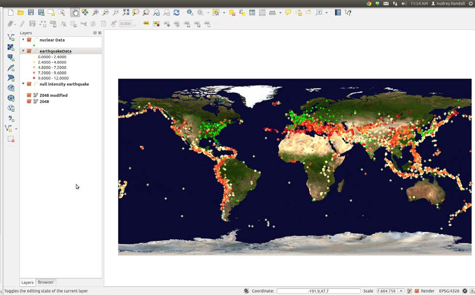
Final version of the map showing the locations of nuclear reactors and earthquakes (colored by intensity)