Presentation
Once a connection has been established between your device and the SOS computer, you are now ready to control the SOS display. Tap on the Presentation icon located in the tab bar of the app (bottom of page).

The Presentation tab of the SOS Remote app.
Playlist / Catalog
Permalink to Playlist / CatalogA presentation playlist is a collection of datasets grouped together in a list for a presentation. The presentation playlist that is currently loaded on the SOS computer is shown on the left hand side of the Presentation tab’s page. (The Playlist item in the Playlist/Catalog toggle must be selected.)
To load a dataset from the presentation playlist onto the sphere, simply tap on the name of the dataset.
To load a new presentation playlist onto the app, tap the Open Folder icon to the left of the Playlist/Catalog toggle. This will open a Load dialog that displays a list of all the presentation playlists in the sosrc/ directory on the SOS computer. Select the presentation playlist of interest. If you want to reload your current presentation without having to find it again in the list, you can tap the Reload Current button in the top left corner of the Load dialog.
The Catalog item in the Playlist/Catalog toggle is used to display dataset search results from searching and browsing on the Data Catalog tab (see the Data Catalog section for more information). Just as with the Playlist list, you can select a dataset from the Catalog list to load it onto the sphere. When you toggle back to the Playlist item, your original presentation playlist will still be showing.
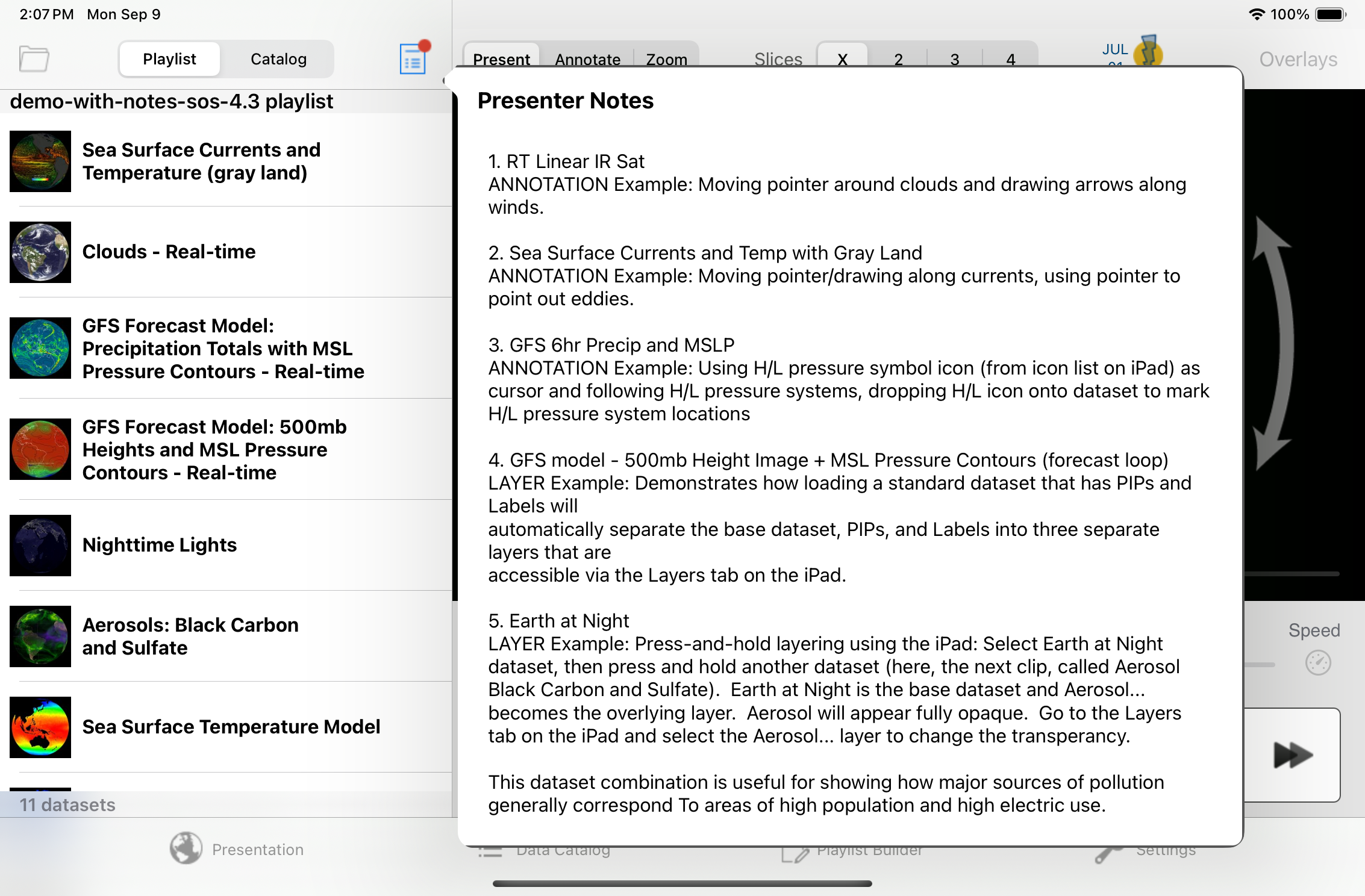
Presenter Notes
Permalink to Presenter NotesPresenter notes allows a presenter to view a set of notes that are associated with their presentation playlist. To show the Presenter Notes, go to the Presentation tab and tap the Presenter Notes icon directly to the right of the Playlist/Catalog toggle button. You can manipulate the text size of the Presenter Notes popup dialog by using pinch gestures and pan around the dialog by dragging with one finger.
To create a set of notes for your presentation playlist, you can use the Playlist Builder (see the Playlist Builder section for more information), the Visual Playlist editor in the Presentation Mode (see the Visual Playlist Editor for more information), or you can use a text editor on your SOS computer to directly edit your presentation playlist (see the Playlist Format Reference for more information.)
Presenter notes in the SOS Remote app.
Orientation
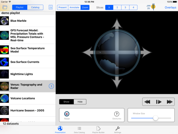
Permalink to OrientationTap on the Presentation icon located in the tab bar, and select the Present button at the top of the Presentation page. This will display the Present tool, which consists of orientation and playback controls.
Before manipulating the orientation of the sphere, first use the User Position slider control on the trackpad to set your desired viewing position relative to the sphere. When you tap and hold on the red circle on the slider, a red dot will appear along the equator of the sphere (the default position places the red dot on the positive x-axis of the sphere at the equator, which corresponds to 0° longitude).
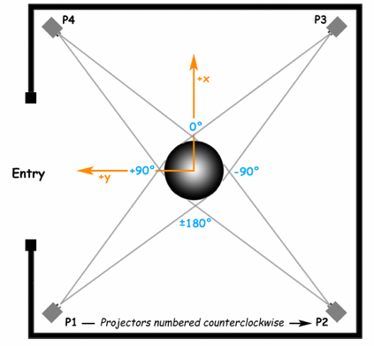
0° longitude corresponds to the positive x-axis, and is typically positioned at the intersection between projectors 3 and 4. The positive y-axis occurs at 90° longitude, between projectors 1 and 4. The location of the entry at your site may be different.
Move the slider left or right until you see the red dot in front of you or at any other desired location on the sphere. Now, all future orientation adjustments will occur relative to this view position.
To adjust the orientation of the sphere, simply slide one finger over the arrows indicated on the trackpad. With the default 0° User Position, the up-down arrows tilt the sphere around the y-axis (pitch), the left-right arrows rotate the sphere around the z-axis (yaw), and the two arrows on either end of the trackpad tilt the sphere around the x-axis (roll). Again, all rotations are relative to the User Position you selected using the slider control.
To reset the orientation of the dataset on the sphere back to its default position, tap the Reset button.
Z-Rotate Button
Permalink to Z-Rotate ButtonTo automatically rotate a time-series dataset (i.e., a movie or image sequence) around the z-axis (the axis that passes through the north and south poles), tap the Z-Rotate button to bring up the Z-Rotation dialog. Tap the On | Off button to turn Z-Rotation On or Off, and change the speed of the rotation by adjusting the slider accordingly. Note that the z-rotation will only be active when a time-series dataset is actually animating (i.e. in Play mode).
Help Guide for Gestures
Permalink to Help Guide for GesturesThe trackpad of the Presentation tab has a number of gestures associated with it that allows you to easily switch between tools as well as control different aspects of individual tools without having to tap on buttons. Tap the ? information button to view a quick help guide for Presentation gestures.
Playback
Permalink to PlaybackTap on the Presentation icon located in the tab bar and make sure the Present button at the top of the Presentation page is selected. To pause or play a dataset, either tap the Pause/Play button, or use a two-finger single tap gesture in the trackpad area.
To step forward or backward frame-by-frame, tap the Forward and Backward buttons, respectively. To fast forward or fast rewind quickly, tap and hold the Forward and Backward buttons, respectively. Note that tapping the Forward or Backward buttons will automatically pause the dataset if it was previously animating.
Frame Slider
Permalink to Frame SliderUse the Frame Slider to quickly scroll through a dataset. If the dataset is animating, the circle on the Frame Slider will automatically progress along the slider. Tapping on the circle at anytime will stop the animation.
Speed Button
Permalink to Speed ButtonTap on the Speed icon button to the right of the Frame Slider to bring up the Playback Speed dialog. Use the slider to dynamically adjust the playback speed (i.e., frames per second) of the dataset that is currently loaded on the sphere.
Layers
Permalink to LayersLayering allows for multiple geographic layers to be present within a single SOS dataset. Each layer’s visual attributes, such as visibility and transparency, can be manipulated. Layering caters to more dynamic presentations and can be used to fluidly demonstrate the relationships between datasets and layers within a dataset.
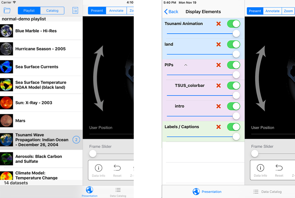
The image on the left shows the list of loaded datasets. The image on the right shows the layers and controls available for the selected dataset, which have replaced the list of datasets.
Pre-Programmed Layers
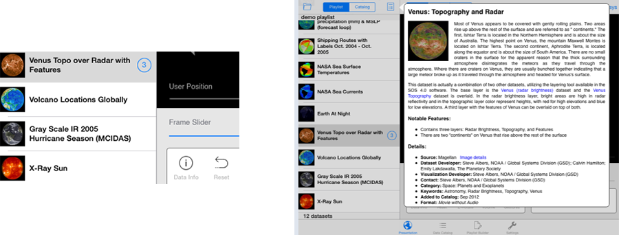
Permalink to Pre-Programmed LayersIn pre-programmed layering, a dataset has already been created to store multiple layers. Select a dataset in the current playlist or in the Data Catalog. If that dataset has any layers associated with it, a layers button (a blue circle with the number of layers in the dataset) will automatically appear next to the dataset’s name.
Tap on the layers button. A list of all the layers in the dataset will appear in the Display Elements list, along with an ON/OFF switch for each layer. To display a layer on the sphere, simply toggle the layer’s switch to ON. To make a layer invisible on the sphere, simply toggle the layer’s switch to OFF. To adjust the transparency of the layer, make sure the layer is turned ON and then adjust the transparency slider for that layer. To delete a layer, tap the X button for that layer. (Note that when you reload the dataset, the previously deleted layer will show up again on the Display Elements list.)
If there is more than one Overlay, the Overlays will be grouped so that you can turn them ON/OFF all together, in addition to controlling them individually. This behavior is the same for PIPs.
PIPs, Labels, and Captions
Permalink to PIPs, Labels, and CaptionsPIPs, Labels, and Captions show up as separate layers on the Display Elements list. However, the number of layers in the layers button does not include these layers in its layer count. It only includes global geographic layers.
Labels and Captions are contained in one Display Element grouping on the SOS Remote app (even though they are actually represented as two Display Elements in SOS). So, if a dataset contains both Labels and Captions, the ON/OFF toggle is applied to both Elements.
Interactive Layers
Permalink to Interactive LayersIn interactive layering, two or more datasets can be combined on the fly during a presentation and then subsequently manipulated as layers. For example, suppose you are displaying the Aerosol Black Carbon and Sulfate dataset (let’s call this dataset A) and you would like to overlay the Earth at Night dataset (let’s call this dataset B) on top of it in order to show how major sources of pollution generally correspond to areas of high population and high electric use.
To do this using SOS Remote, you tap on dataset A to load it on the sphere, find dataset B either in your Playlist or from somewhere in the Data Catalog, and then press and hold dataset B for a few seconds. Dataset B will show up fully opaque on the sphere. Go to dataset A, tap on its layers button, find dataset B in the Display Elements list, and adjust its transparency so that dataset A will show through B.
Overlays
Permalink to OverlaysThe SOS Data Catalog includes a number of Overlay datasets, such as City Names, Country Borders and Atmospheric General Circulation. Overlays are datasets with transparent backgrounds that contain foreground data used to augment other SOS datasets. Overlays can help provide context for your audience and make the datasets easier to understand, as well as provide information that may be useful to illustrate related global ideas.
Overlays are accessible on the SOS Remote app for the iPad on version 4.0.2 and above. Simply tap the Overlays button in the upper right hand corner of the Presentation tab to open the list of available overlays, select an overlay, and that overlay will get dynamically layered on top of the currently playing dataset.
For each overlay that is interactively added/deleted, the number in the layers button will get automatically incremented/decremented.
If you want your site’s custom overlays to appear in the Overlays dialog of the iPad app just as the NOAA-managed overlays appear for quick and dynamic layering, do the following:
- In your dataset’s playlist.sos file, add the following attribute/value pair
(this is optional and allows your overlay to show up in the Overlays category
in SOS Stream GUI’s Library menu):
category = overlays - In your dataset’s playlist.sos file, add the following attribute/value pair
(this is what makes your overlay appear in the iPad app’s Overlays dialog.
Note the uppercase “O”):
subcategory = Overlays - On the SOS computer’s SOS Stream GUI application, select the LibraryUpdate Library menu option to update the Data Catalog with your new overlay dataset. Once this is complete, on the iPad app’s Settings tab, select the Update Now button, and your overlay dataset will appear in the Overlays dialog of the iPad
Annotation
Permalink to AnnotationAnnotation allows pointing and drawing on the sphere to dynamically highlight areas of interest during a presentation. In addition, icons related to datasets can be dropped onto the sphere. Annotation provides extra visual cues for the audience, and can serve as a helpful storytelling mechanism.
Tap on the Presentation icon located in the tab bar and select the Annotate button at the top of the page. (Alternatively, if you are on the Present tool, you can do a two finger double tap on the trackpad to get to the Annotate tool.) A white cursor appears on the sphere. The cursor will be located at either the last set User Position (the red dot) or at the last recorded position of the cursor. The Reset button moves the Point or Draw cursor back to the last set User Position (as set on the Present page). This is useful in case you lose site of the cursor.
When a new dataset is selected from the playlist, all drawings and icons are automatically cleared and the Presentation tab is reset to display the Present tool.
The Annotate tool in the SOS Remote app.
Point Mode
Permalink to Point ModeDrag one finger over the trackpad (the trackpad should be displaying a white cursor) to move the cursor on the sphere.
Draw Mode
Permalink to Draw ModeFirst position the white cursor on the sphere. Then, double tap the trackpad (or tap the Draw button) with one finger to get into Draw Mode. A yellow marker will appear on the trackpad and on the sphere. Drag one finger over the trackpad to draw on the sphere. To draw at another location, you must first get back into Point Mode (by one finger double tapping the trackpad or by tapping the Point button), position the white cursor, and then get back into Draw Mode to draw.
You can select line color and line width by tapping the Lines button to open the Lines dialog.
All drawing can be cleared by tapping the Clear button or by doing a two finger single tap on the trackpad. Note that drawings can be cleared while in Point Mode or Draw Mode.
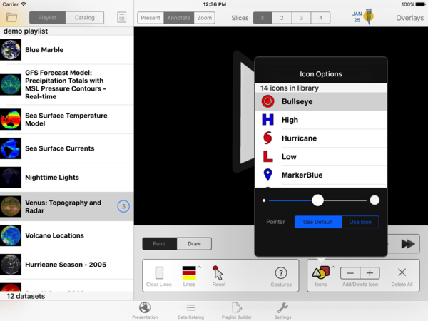
Drop Icons
Permalink to Drop IconsOpen the Icons dialog by tapping the Icons button. Select an icon from the library. Close the Icons dialog. Position your cursor on the sphere where you would like to drop the icon. Now, tap and hold on the trackpad with one finger to drop an icon onto the sphere. Alternatively, you can tap the + button to drop an icon. Use the - button to remove the last added icon. Use the X button to clear all icons on the sphere or use a three finger single tap to clear all icons.
The size of the icon can be adjusted by using the slider in the Icons dialog.
Icons can be dropped and cleared while in Point Mode or Draw Mode.
Help Guide for Gestures
Permalink to Help Guide for GesturesThe trackpad of the Presentation tab has a number of gestures associated with it that allows you to easily switch between tools as well as control different aspects of individual tools without having to tap on buttons. Tap the ? information button to view a quick help guide for Annotation gestures.
Zoom
Permalink to ZoomThe Zoom tool allows zooming in over a region of the sphere for a closer look at the data. The zooming is done via a magnifying glass that appears on the sphere.
Tap on the Presentation icon located in the tab bar and select the Zoom button at the top of the page. (Alternatively, if you are on the Present page, you can do a one finger single tap on the trackpad to get to the Zoom page.) A magnifying glass appears on the sphere. The magnifying glass will be located at either the last set User Position (the red dot) or at the last recorded position of the magnifying glass.
Drag one finger over the trackpad to move the magnifying glass on the sphere. Use the two finger pinch-in and pinch-out gestures on the trackpad to increase and decrease, respectively, the scale of the view in the magnifying glass. Use the Window Size slider to change the window size of the magnifying glass. You can toggle the magnifying glass on or off by selecting the Show or Hide buttons, respectively. The Reset button moves the magnifying glass back to the last set User Position (as set on the Present page).
When a new dataset is selected from the playlist, the magnifying glass is automatically cleared and the Presentation tab is reset to display the Present tool.
The Zoom tool in the SOS Remote app.
Help Guide for Gestures
Permalink to Help Guide for GesturesThe trackpad of the Presentation tab has a number of gestures associated with it that allows you to easily switch between tools as well as control different aspects of individual tools without having to tap on buttons. Tap the ? information button to view a quick help guide for Zoom gestures.
Splitter Tool
Permalink to Splitter ToolThe Splitter tool partitions an SOS dataset into multiple slices that are replicas of the slice of data that is currently being displayed on the sphere at the center of the User Position (the red dot). This feature is especially useful for presenting to large groups of people that are located all around the sphere. The Splitter tool works with both animations and still images. Note that rotation can be jittery for some datasets when there are more than two slices displayed.
The control called Slices at the top of the Presentation tab page is used to control the Splitter. It has four buttons to set the number of slices to replicate. Simply tap on a number to replicate the sphere data that many times, or tap the x button to turn off the Splitter and resume normal display of the dataset on the sphere.

Splitter tool
Data Info
Permalink to Data InfoTo view information about the dataset that is currently loaded on the sphere, go to the Presentation tab and select the Present button at the top of the page. Then, tap the Data Info button to bring up the information dialog. You manipulate the font size of the text in the Data Info popup using pinch gestures and pan around the pane by dragging with one finger.
Additional information about a dataset is available to you from the SOS Remote app tapping on the Data Info button while using the Present tool.
Volume
Permalink to VolumeTo increase or decrease the volume of a dataset that has audio, tap on the Presentation icon located in the tab bar and select the Present button at the top of the page. Tap on the Volume button to bring up the Volume dialog and adjust the volume slider accordingly.