 Science On a Sphere
Sea Surface Temperature Anomaly - Real-time
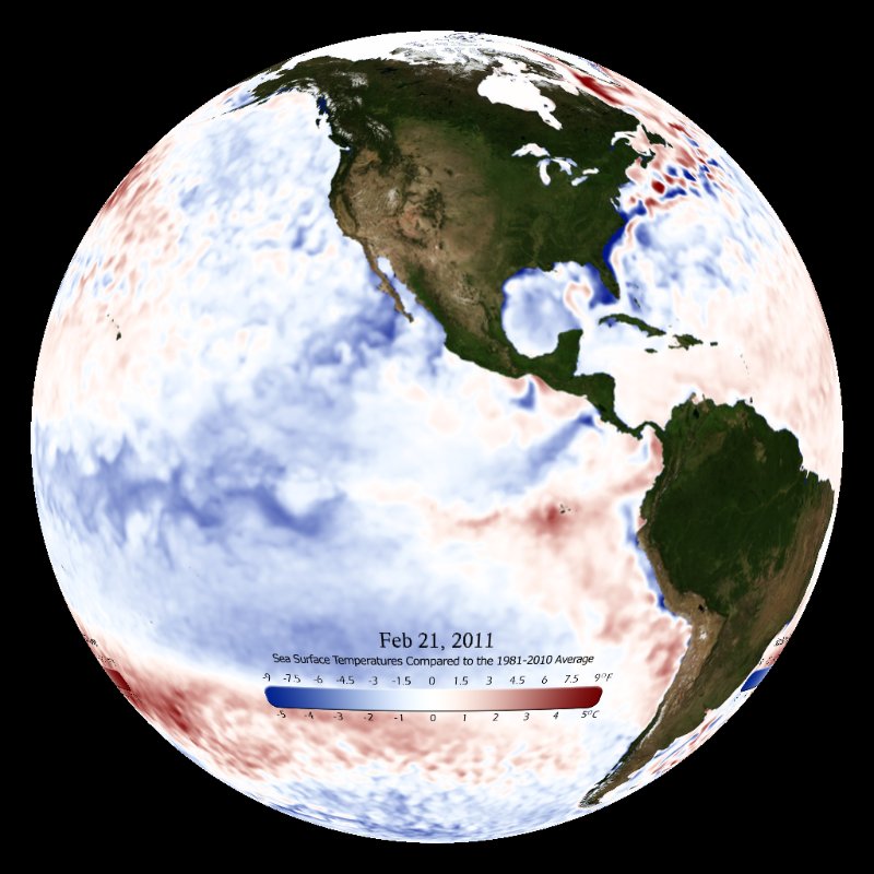
This real-time dataset shows the past year of sea surface temperature compared to the recent average.

Most of the time, ocean temperatures stay fairly stable. But sometimes, subtle changes can have big impacts. Anomaly maps help us see the difference between what’s typical and what’s unusually warm or cool. In this lesson, students will examine Sea Surface Temperature Anomaly maps to track a major shift off the western coast of South America, known as El Niño-perhaps the strongest one on record. Then students will compare the super El Niño to a normal year. Finally, students will complete a jigsaw reading activity with brief NOAA articles.
What’s going on here? What do you see that makes you say that?
In this short activity, students will strengthen their critical thinking skills by carefully observing art, then data, forming ideas, and backing them up with evidence. Student worksheets are digitally fillable pdfs, making it easy to add them to their digital platforms.
While this activity encourages deeper observation and inquiry while practicing scientific literacy, it also connects to topics like ocean warming, thermal dynamics, weather patterns, tropical cyclone formation, coral reef bleaching,global effects of ocean dynamics and climate change. If you’re covering any of these, this could be a great addition to your unit!
Special thanks to Yuko Shimizo for allowing the limited use of her spectacular illustration.
This real-time dataset shows the past year of sea surface temperature compared to the recent average.