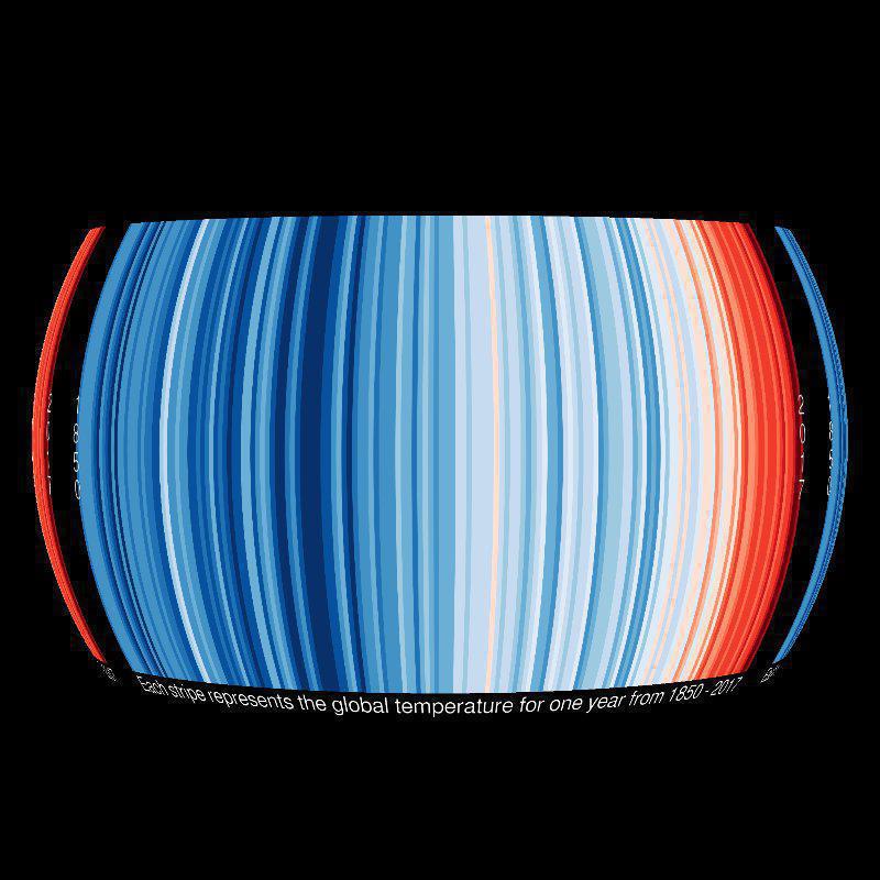
"Climate change is a complex global issue, requiring simple communication about its effects at the local scale. This set of visualisations highlight how we have witnessed temperatures change across the globe over the past century or more. The colour of each stripe represents the temperature of a single year, ordered from the earliest available data at each location to now. All other superfluous information is removed so that the changes in temperature are seen simply and undeniably." Climate Lab Book UK.
Related datasets in our catalog, Warming Stripes: United States, Warming Stripes: Australia, and Warming Stripes: Germany show a little bit more of the year to year changes seen in weather. This dataset paired with the more localized versions can be a great tool for illustrating weather vs. climate. For example, the warmest years on record, globally, have been in the last decade from 2008-2018.That is not necessarily the case for each countries' temperature record seen in the warming stripes. Year to year temperature changes are a product of weather variability, where as, warming over centuries is climate change due to greenhouse gas increases in Earth's atmosphere.
The warmest years on record have been in the last decade from 2008-2018
Year to year temperature changes are a product of weather variability, where as, warming over centuries is climate change due to greenhouse gas increases in Earth's atmosphere.