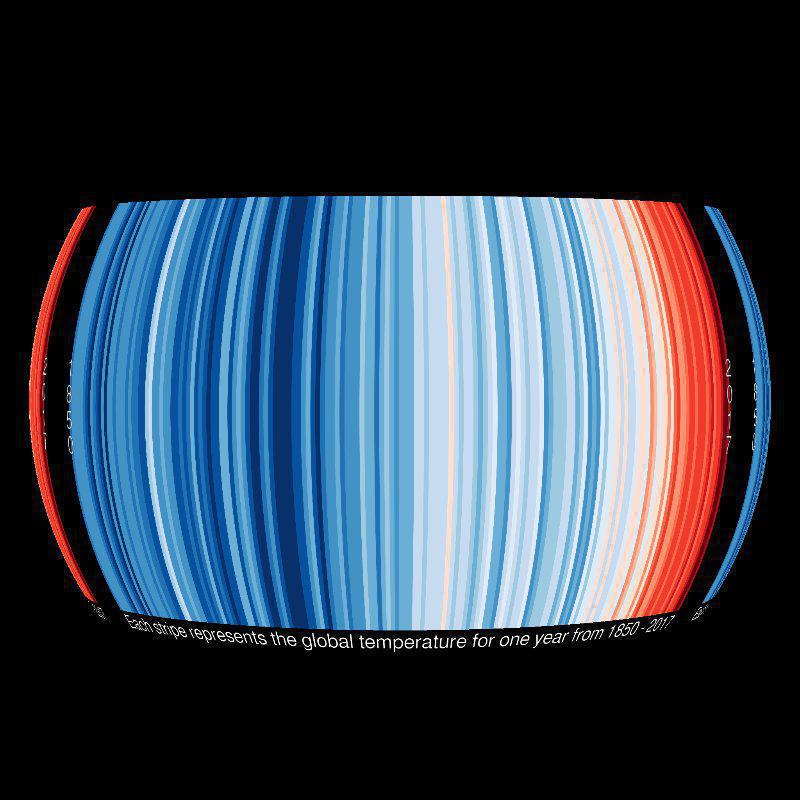
Each stripe in this image shows a year of average temperature from 1910, 1881, 1895 (respectively) to 2017 for three different countries: Australia, Germany, and the USA. The temperature trend of warming over time seen in the temperature record - measured in 1850 by thermometers and now through satellite remote sensing with infrared instruments - is overwhelmingly clear when seen in our related dataset Warming Stripes: Global. This dataset, on the other hand, shows more of the year to year changes seen in weather. Pairing the two datasets can be a great tool for illustrating weather vs. climate. For example, the warmest years on record, globally, have been in the last decade from 2008-2018. That is not necessarily the case for each countries' temperature record seen in the warming stripes. Year to year temperature changes are a product of weather variability, where as, warming over centuries is climate change due to greenhouse gas increases in Earth's atmosphere. To find out more about this dataset, visit the Climate Lab Book.
The warmest years on record globally averaged have been in the last decade from 2008-2018
Year to year variations in temperature average can be seen more dramatically in the countries warming stripes as compared to the Warming Stripes: Global.
Year to year temperature changes are a product of weather variability, where as, warming over centuries is climate change due to greenhouse gas increases in Earth's atmosphere.