Temperature Anomaly: Yearly (NASA) - 1884 - 2022
Details
Permalink to Details- Added to the Catalog
- Available for
- SOS
- Categories
- Air: Temperature Change, Weather
- Keywords
- Anomaly
- Atmosphere
- Climate
- Global Warming
- Temperature
- Weather
Description
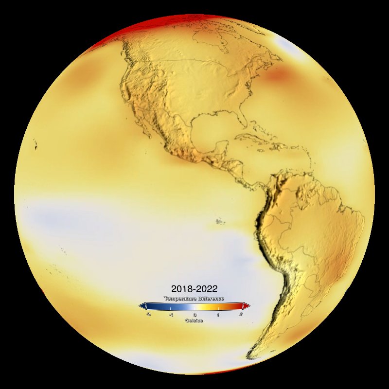
Permalink to DescriptionThese maps, developed by NASA's Goddard Institute for Space Studies (GISS), depict how much various regions of the world have warmed or cooled when compared with a base period of 1951-1980. They show temperature anomalies, or changes, not absolute temperature.
The objective is to produce a key data record describing ongoing climate change and a basis for evaluating simulations of global changes in response to changes of atmospheric carbon dioxide, aerosols, and solar activity.
The temperatures we experience locally and in short periods can fluctuate significantly due to predictable cyclical events (night and day, summer and winter) and hard-to-predict wind and precipitation patterns. But the global temperature mainly depends on how much energy the planet receives from the Sun and how much it radiates back into space − quantities that change very little. The amount of energy radiated by the Earth depends significantly on the chemical composition of the atmosphere, particularly the amount of heat-trapping greenhouse gases.
To conduct its analysis, GISS gathers publicly available data from 6,300 land-based meteorological stations around the world; ship-based and satellite observations of sea surface temperature; and Antarctic research station measurements. These data sets are loaded into a computer analysis program − available for public download − that calculates temperature change relative to the average temperature for the same time period (month or year) during 1951-1980.
NASA uses the period from 1951-1980 as a baseline to understand how global temperatures change over time. That baseline includes climate patterns such as La Nina and El Nino, as well as unusually hot or cold years due to other factors, ensuring that it encompasses natural variations in Earth's temperature.
Shades of red and orange indicate areas where the average monthly temperatures are warmer than they were in that area during the base period from 1951-1980. Shades of blue show cooling compared to the base period. For example, if New England is red in a March of a given year, then it is warmer than the average March in New England from 1951-1980. If part of Canada is blue in August, then it is cooler than the average for August during the base period. Black areas are where no data are available.
Notable Features
Permalink to Notable Features- 2016 is the warmest year on record (as of 2022)
- Starting in 2022, the past nine years have been the warmest years since modern record keeping began in 1880
- The Arctic has experienced the strongest warming trend, close to four times the global average
- All temperatures in this dataset are compared to "normal" which is the 1951 - 1980 mean temperature