Agriculture: Cropland Yield (potential)
Details
Permalink to Details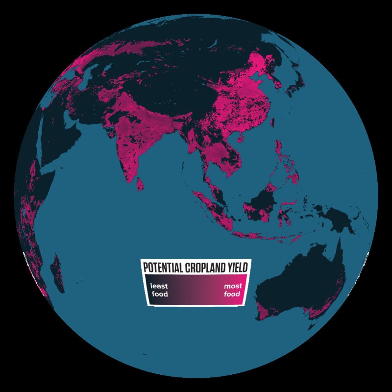
Description
Permalink to DescriptionA major component of the 2 Billion More Coming to Dinner film, these datasets show current and potential yields for the three top crops, corn, wheat and rice, measured in tons per hectare. Potential yield for a given area is determined by using the productivity of another region with analogous environmental conditions and optimized water and nutrient input as a benchmark. In this map, darker areas show smaller yields, while bright pink areas indicate higher yields.
The Cropland Production Gap map highlights the difference between current and potential yields. While some regions may have a very high potential yield, it may already be nearly equaled by their current yields. (See the American Midwest for areas that are producing very near to their full potential.) Regions with greater room for improvement, however, stand out in bright yellow on the yield gap map. Bright spots in Asia, West Africa, Eastern Europe and Central America, for instance, indicate locations where significantly more food can be produced.